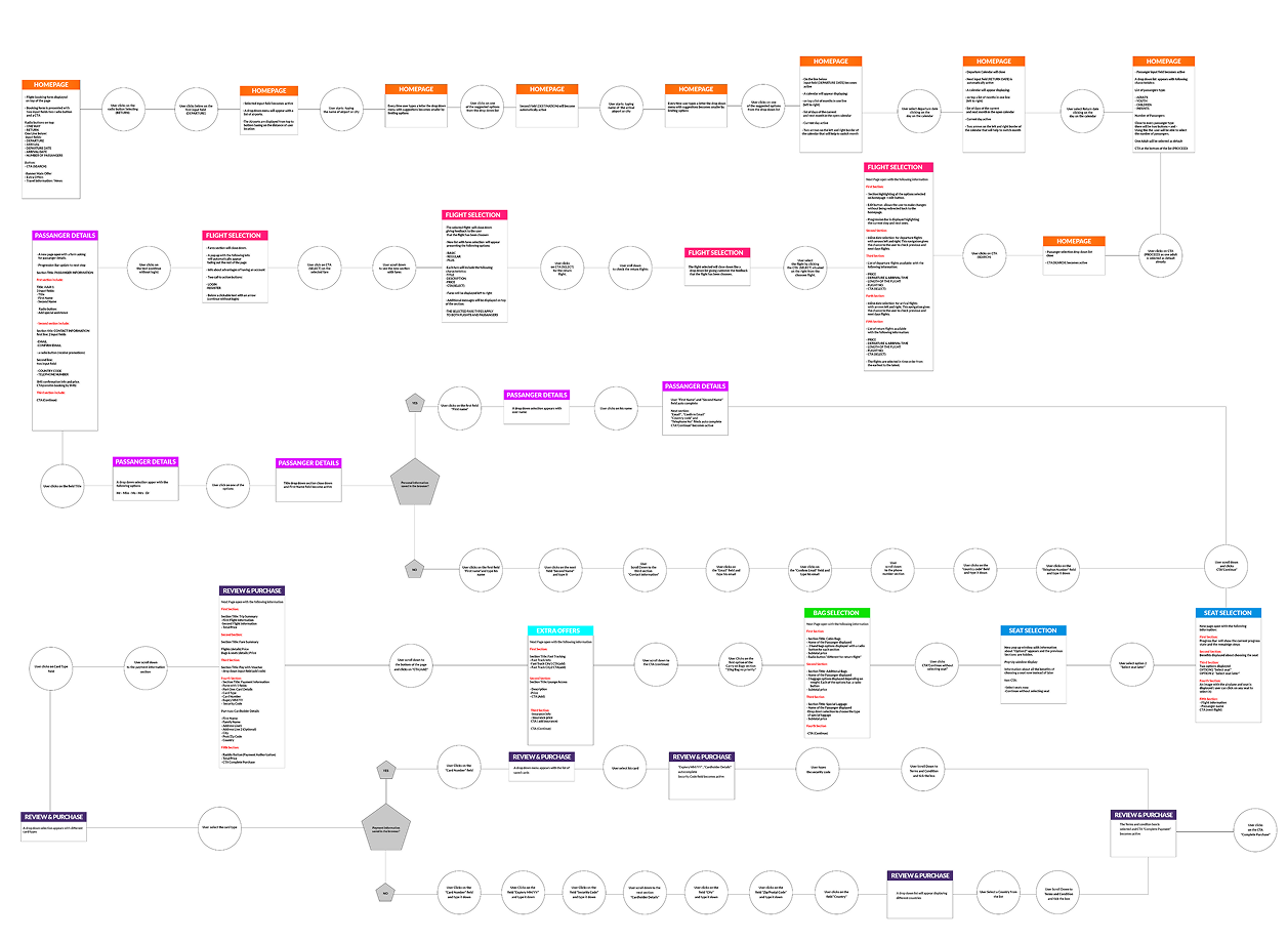
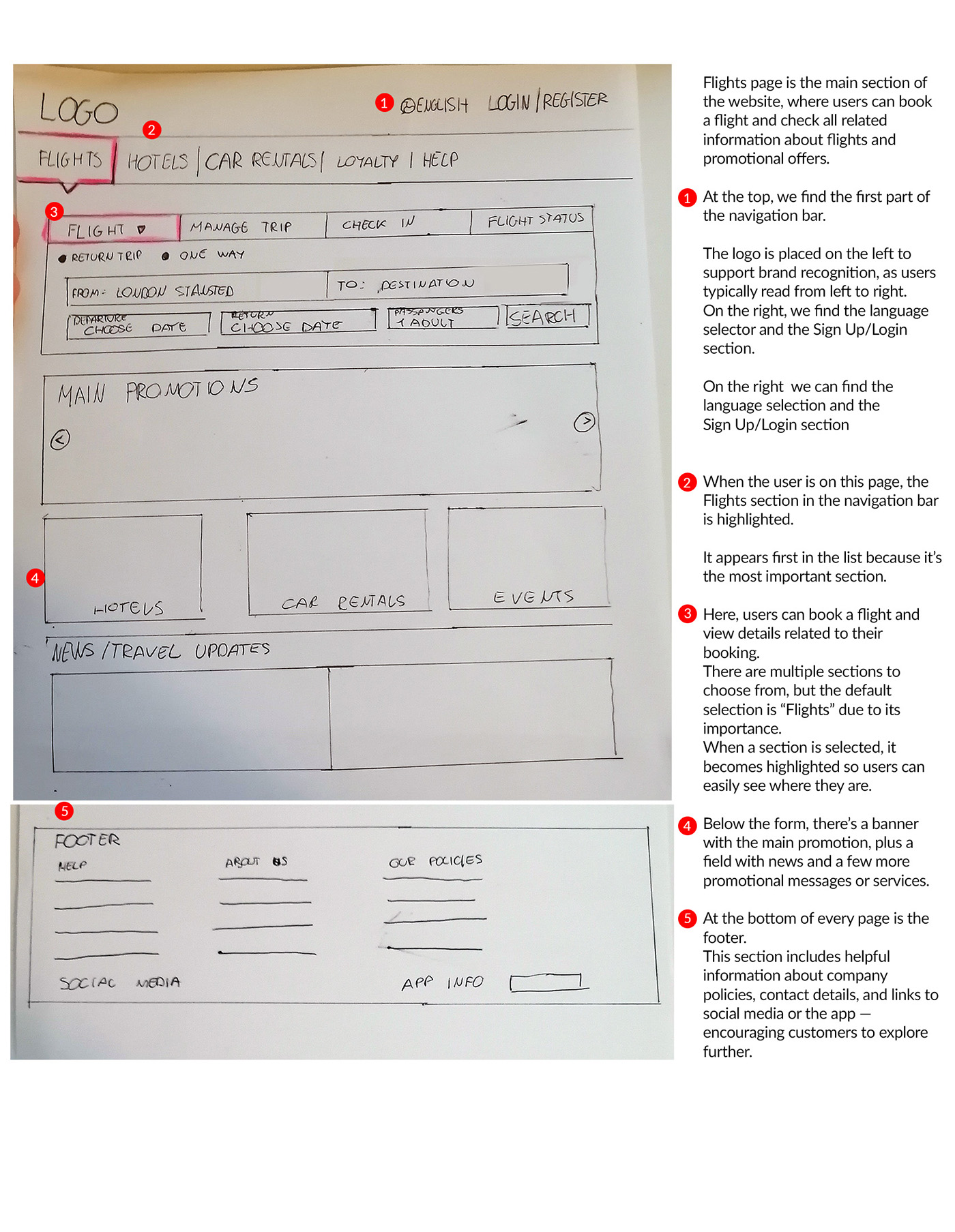
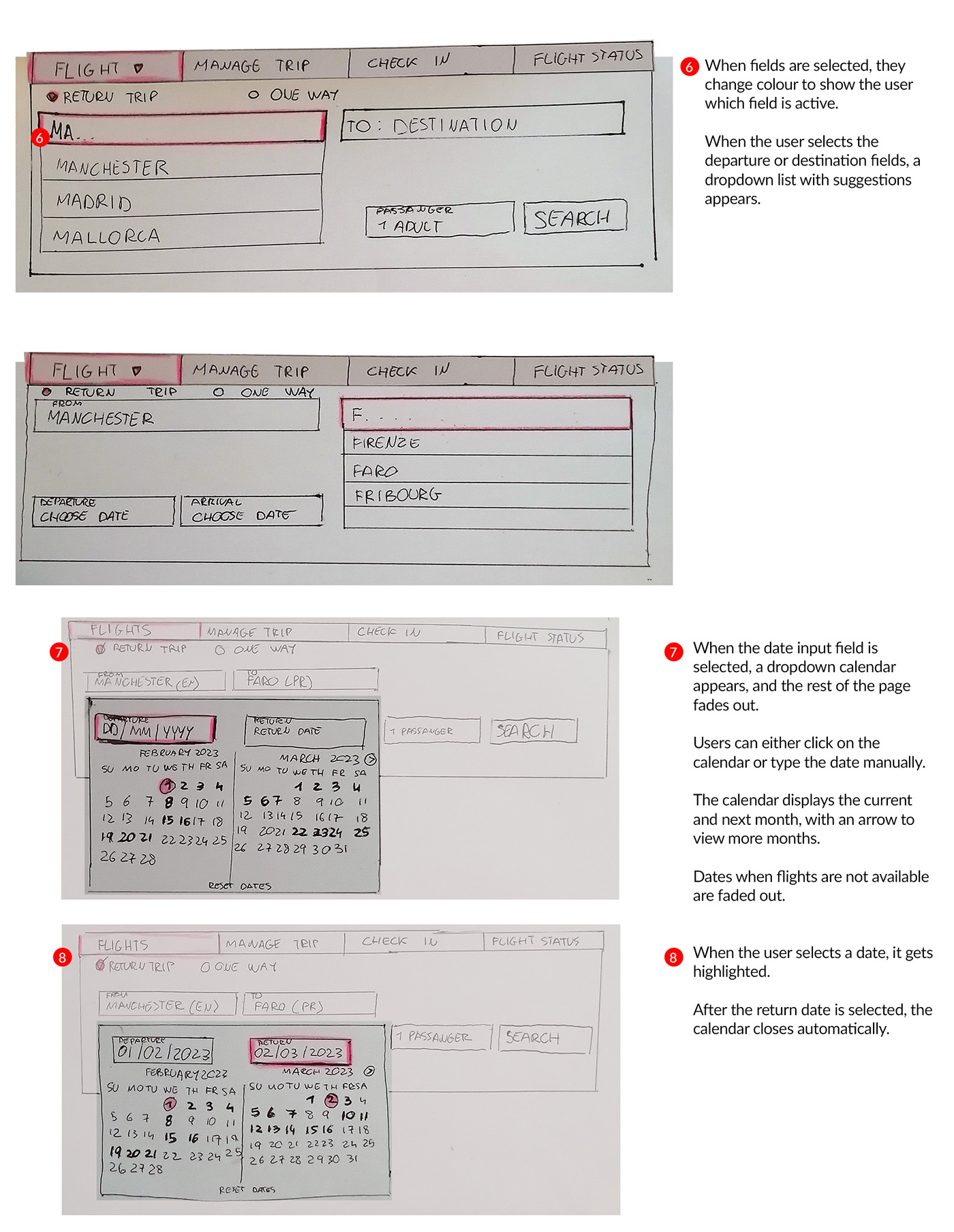
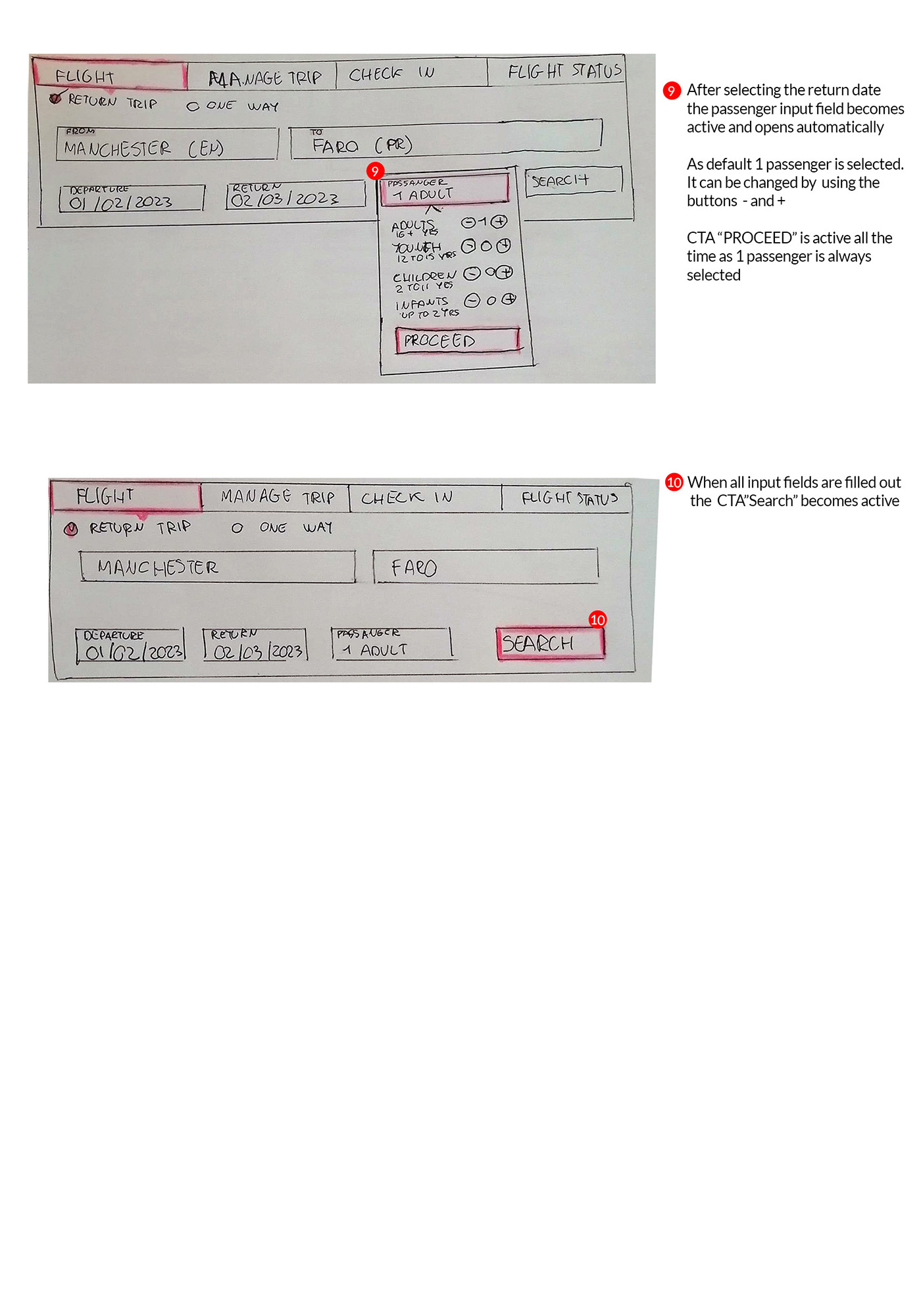
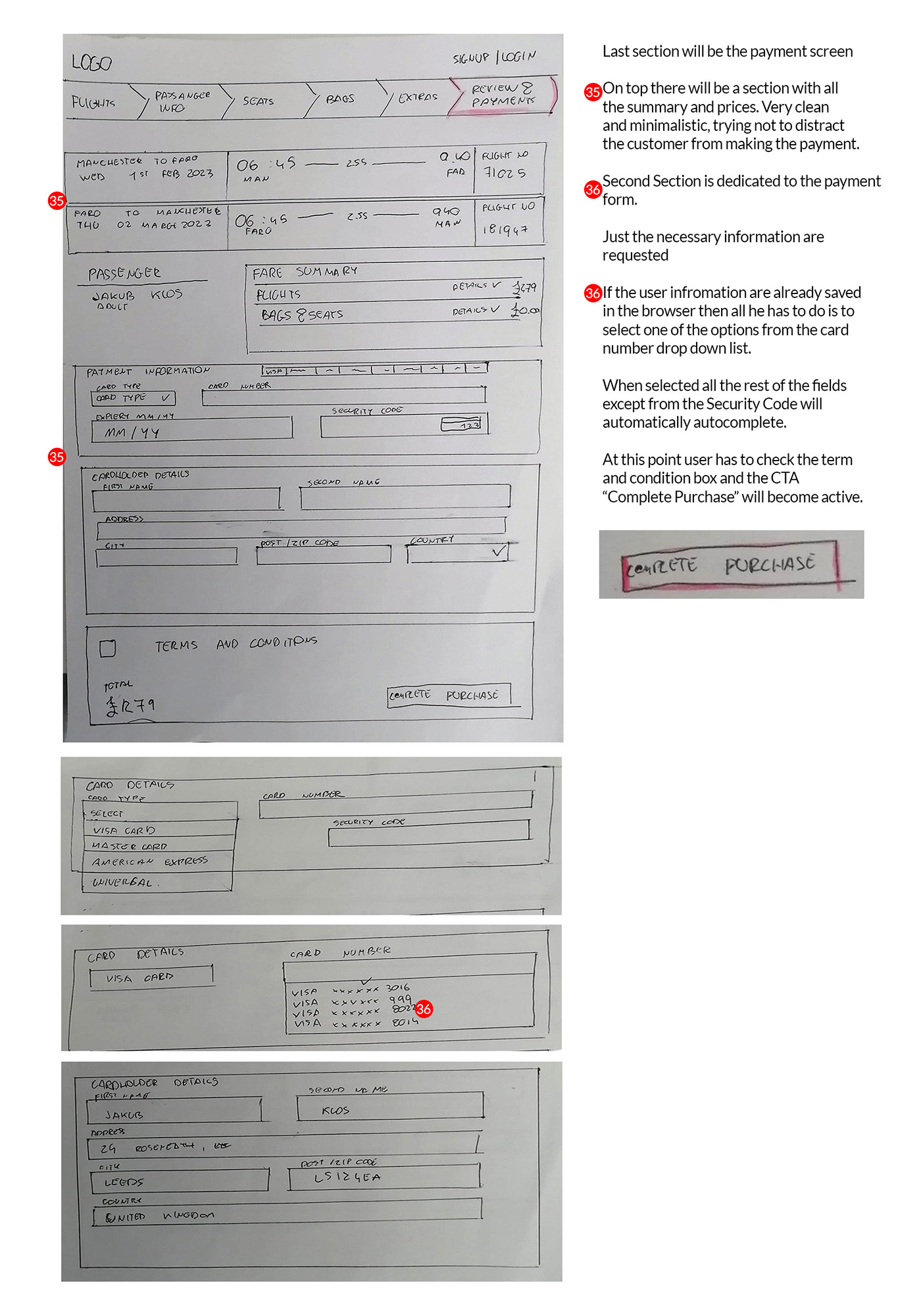
Booking Flow - UX Case Study
THE ART OF SELLING MIRRORS ONLINE

Objective

Redesign the desktop booking flow of an airline website to improve clarity, usability, and user confidence.

Results

Improved usability through clearer CTAs, simplified terminology, and a streamlined flow based on real user feedback.

    01 Project Overview
    About Skylift
    Skylift is a concept airline website I designed as part of my UX Design diploma at the UX Design Institute. The goal was to simulate a real-world UX project by redesigning the desktop booking flow, from homepage to payment, and delivering a high-fidelity prototype ready for developer handoff.

    Although not built for a real client, the project followed a complete UX process, including user research, usability testing, affinity diagramming, journey mapping, wireframing, and high-fidelity prototyping. It helped me develop practical skills in structuring user flows, simplifying complex decisions, and designing clear, user friendly interfaces.
      The Challenge
      The goal was to design a booking flow that felt smoother and more user-friendly than what most airlines offer. I didn’t want to just copy common patterns, I looked at what wasn’t working on competitor websites, like too many steps, confusing layouts, or missing information.

      Based on this research, I focused on creating a cleaner and more focused experience that would guide users clearly from start to finish.
        My Role
        • Led the end-to-end UX and UI design process for the booking flow redesign
        • Conducted user research, including surveys and usability testing
        • Defined user flows and improved the information architecture
        • Collaborated closely with stakeholders and developers to ensure feasibility and alignment
        • Delivered detailed developer handoff documentation and annotations to support smooth implementation
        02 RESEARCH
        Understanding the Booking Experience
        To better understand how people book flights online, I combined a short survey with usability tests. I also included a quick interview before each usability session to get extra context around the users' typical habits and expectations.
        Survey
        The survey included 10 questions  focused on uncovering general flight booking behaviour including:
        • What devices they use to book the flights
        • How often people fly
        • Which platforms they prefer and why
        • What factors matter most when booking (e.g. price, timing, baggage)
        I used a mix of closed questions (for clear, quantifiable data) and open-ended questions to collect personal opinions and pain points in their own words.
        Takeaways from the survey:
        • Most people fly 1–4 times per year, mainly for leisure
        • Price, flight time, and baggage are the top decision factors
        • Desktop is the preferred platform for visibility and comparison
        • Some users had issues like unclear pricing, missing features, or not finding suitable flights
        Usability Testing
        The usability tests offered more detailed insights. I observed users completing flight bookings on Aer Lingus and Eurowings websites.

        The findings revealing issues like:
        • Call-to-action buttons being missed or unclear
        • Fare names and pricing terms causing confusion
        • Flight times weren’t always clear or easy to compare
        • Users liked using a calendar to pick travel dates
        • Having all the key info (flights, times, fares) on one screen was reassuring
        • Features like “Lock Price” were seen as helpful - when they were easy to understand
        Together, the survey and testing helped me understand both the context of how people book flights, and the usability issues they face during the process.
        “Sorting and grouping feedback during the affinity mapping process”
        Affinity Diagram
        After collecting feedback from the survey and usability testing, I needed a way to organise everything clearly and start seeing patterns. I used an affinity diagram to group similar comments and observations together.I split the feedback into categories like:
        • Overall Process
        • Homepage
        • Filling Flight Details
        • Selecting Flights
        • Fares
        • Design
        • User Behaviours & Preferences (based on survey insights)
        To make things easier to interpret, I used green sticky notes for positive feedback and red for pain points. This visual approach helped me quickly spot areas that worked well and those that needed improvement — like confusing terminology, missed CTAs, and unclear price details.
        Journey Mapping
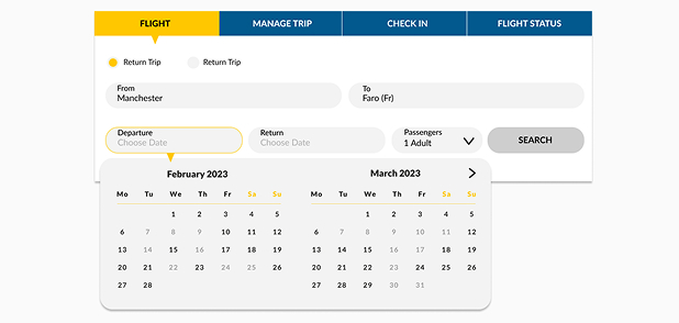
        After organizing the insights from the affinity diagram, I created a customer journey map to visualise the full booking process from the user’s perspective - including their actions, thoughts, and emotions at each step. I mapped out the typical flow across key stages:
        • Homepage
        • Flight selection
        • Fare selection
        • Passenger details
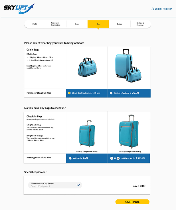
        • Extras (baggage, seats)
        • Review & payment
        For each step, I included:
        • What users were trying to do
        • What they were thinking or feeling
        • Pain points they encountered
        • Opportunities to improve the experience
        One thing that stood out was how quickly confusion could set in  just a small issue like unclear wording or too many fare options could break trust or create hesitation.

        Seeing this journey laid out helped me focus the redesign on clarity, consistency, and minimising friction at every step.
        03 DESIGN PROCESS
        Flow Diagram
        Once I understood the full user journey, I created a flow diagram to plan out the structure of the booking process. This helped me see how users move through each step, from picking a destination all the way to payment.
          • Key decision points
          • Possible user paths
          • Areas where users might drop off or feel unsure
          My Role
          Each screen was broken down into simple steps, helping me identify moments where information overload or unclear terminology might cause confusion.

          This also gave me a solid structure to follow when designing the wireframes and later the high-fidelity prototype.

          This step helped me stay focused on usability - making sure each interaction was purposeful and supported the user's goal without unnecessary friction.
          Wireframes
          To start shaping the new layout, I sketched a set of low-fidelity wireframes by hand. This helped me explore layout ideas quickly and figure out how to organise the content in a more user-friendly way.
            I highlighted the key elements and decisions on each page to make it easier to understand the structure and flow at a glance. This stage helped me focus on the layout and usability without getting distracted by visuals or styling.
                04 FINAL PROTOTYPE
                Prototyping & Refinements
                After finishing my wireframes, I started building a high-fidelity prototype in Figma. I kept the layout clean and consistent so users could focus on booking a flight without distractions.

                The clickable prototype covers the full booking journey — from picking a flight to entering passenger details and making a payment. While designing, I focused on:
                • Making buttons (CTAs) easy to see and usel Process
                • Using simple, clear language based on user feedback
                • Keeping related info grouped together (like flights, fares, and extras)
                • Avoiding overload by only showing what’s needed at each step
                • Making sure everything is easy to read and works well on different screens
                The design was based on everything I learned from research and usability testing. I kept testing and adjusting the flow to make sure each step felt smooth and easy to follow.
                Developer Handoff
                Once the prototype was done, I created detailed annotations for every screen to make the handover as clear as possible.

                My goal was to make sure developers wouldn't have to guess how things should work.I went through each step of the booking flow and added notes explaining:
                • What happens when users click or hover
                • How forms behave (like field validation or auto-filled data)
                • What default values show up
                • Font sizes, button styles, and color codes
                • Responsivness
                I basically walked through the whole experience from a developer’s point of view, trying to make sure everything was covered. This helped avoid confusion later and kept the design easy to build exactly as planned.
                05 FINAL THOUGHTS
                What did I learn
                This project helped me put into practice the full UX process, from research to prototyping, and taught me how each step connects to real user needs.

                I learned how small design choices, like clear CTAs or simplified steps, can make a big difference in building trust and improving usability.
                  Reflections on the Process
                  Working on this made me appreciate how much insight even a small bit of user feedback can bring - and how important it is to keep testing and iterating, not just design something that looks good.
                  What would I do differently
                  If this were a real product, I would definitely go further with:
                    • Since I finished this project, my way of working in Figma has become more structured — especially in prototyping, where I now use variables and styles.
                    • More usability testing at different stages, especially with a wider range of users (age, tech ability, travel habits)
                    • I would focus more on overall UI design, spacing, and consistency.
                    • A/B testing different flows or copy to see what performs best
                    • A/B testing different flows or copy to see what performs best
                    • Collaborating closely with developers earlier in the process to ensure technical feasibility
                    • Testing the final prototype in a mock website to simulate a realistic user journey and identify any last usability issues before handoff.
                    • Tracking analytics post-launch to identify drop-off points or confusion that didn’t show up in early testing
                    Thank you! Your submission has been received!
                    Oops! Something went wrong while submitting the form.