Competitive Analysis
To get started, I looked at other high-end mirror brands and home décor e-commerce sites. I wanted to understand what makes them feel premium and how they guide users through their sites. Here’s what I focused on:
Website structure & user flows
How do competitors guide users to purchase?
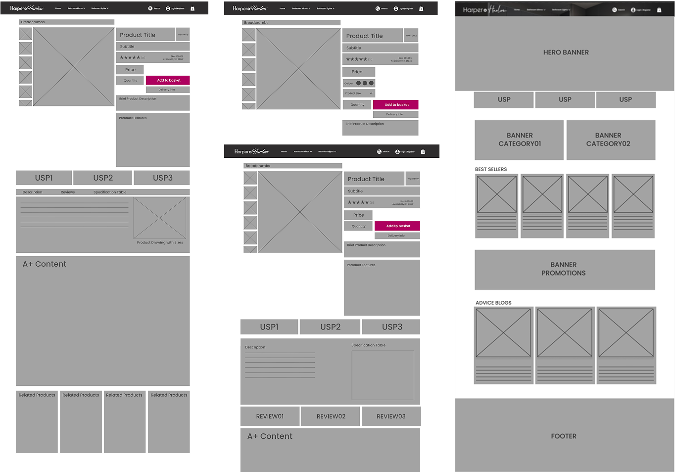
Product presentation
What makes certain brands feel more premium?
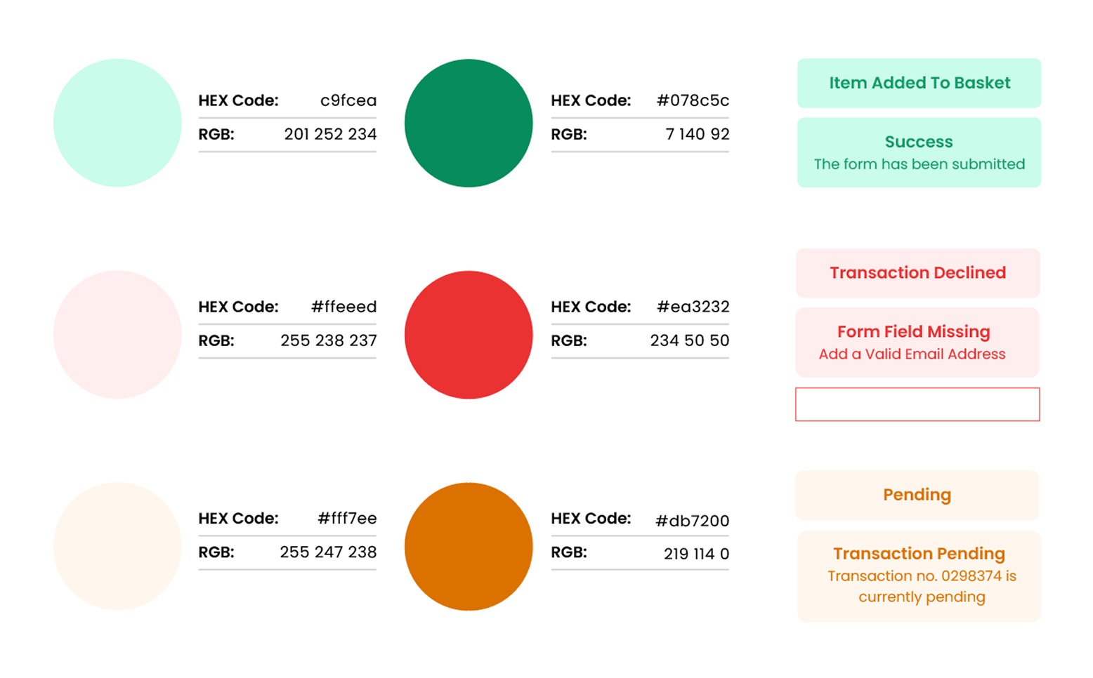
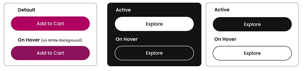
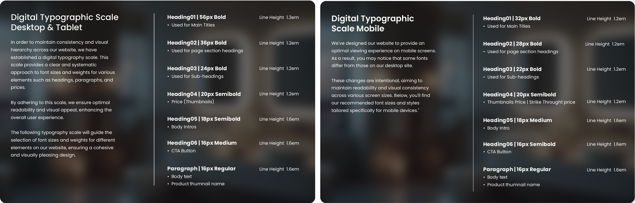
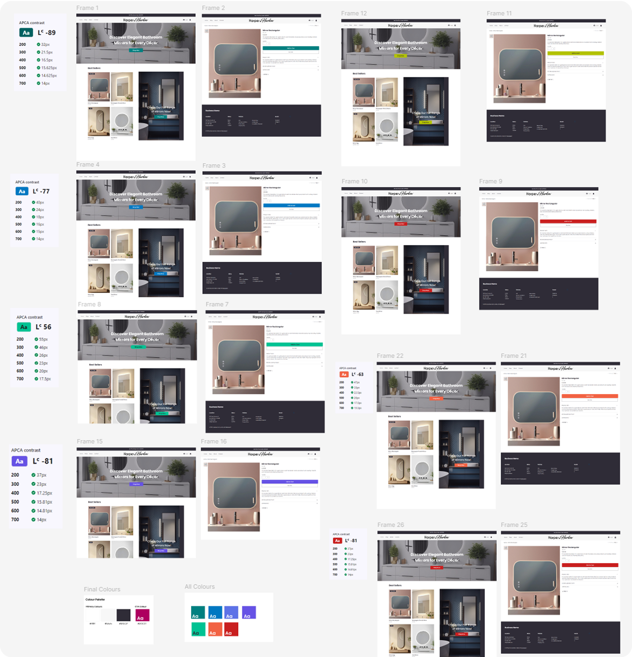
Brand identity & visual language
Which colors, typography, and styles resonate with this market?
Pain points
What are common usability issues in competitor websites?
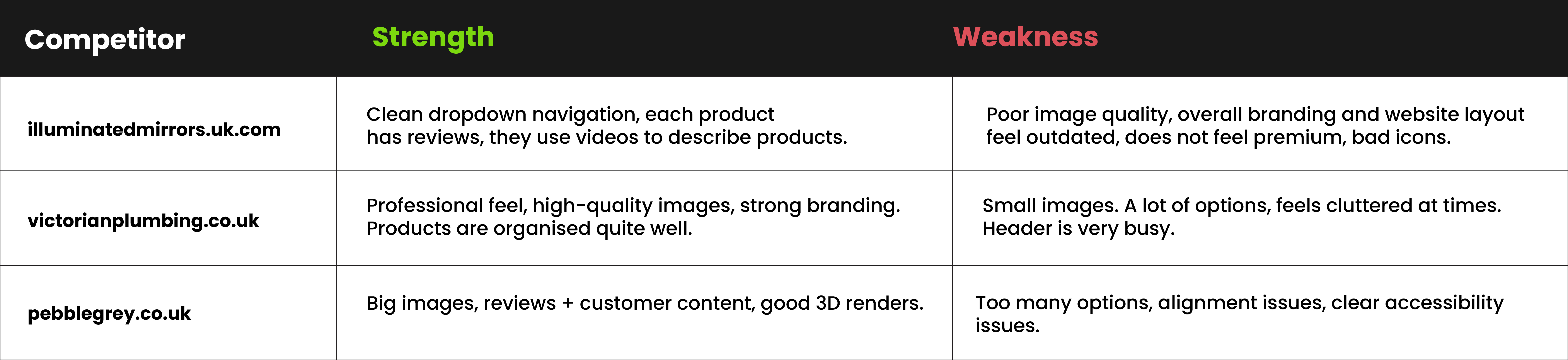
After analysing competitors, I had a much clearer direction for the design.
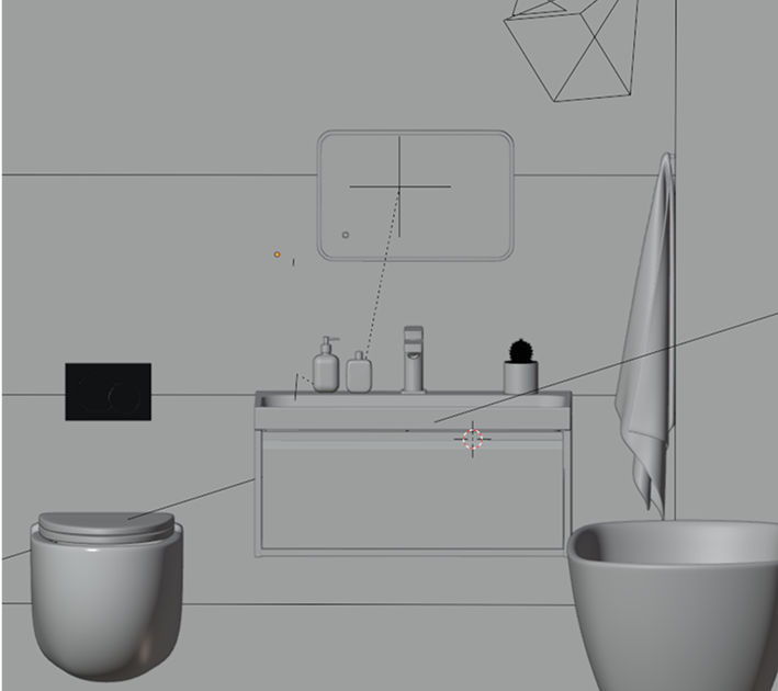
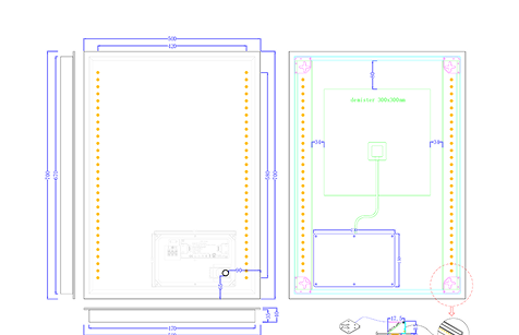
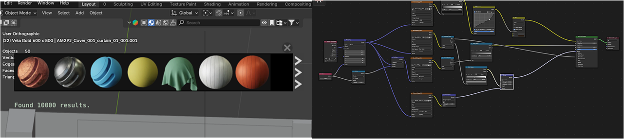
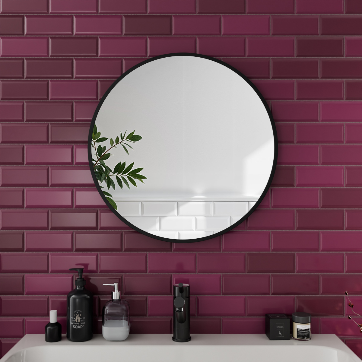
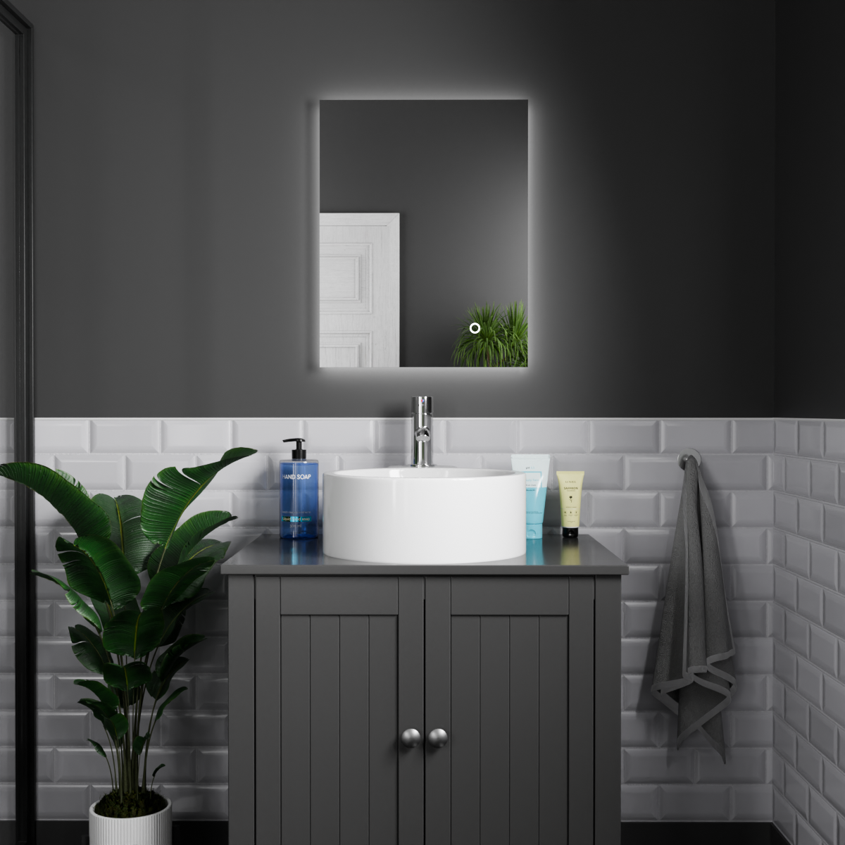
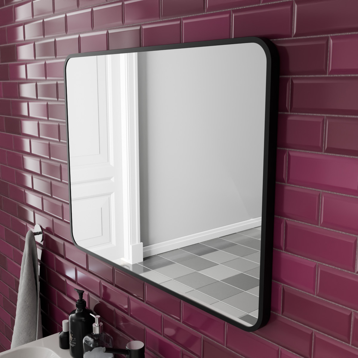
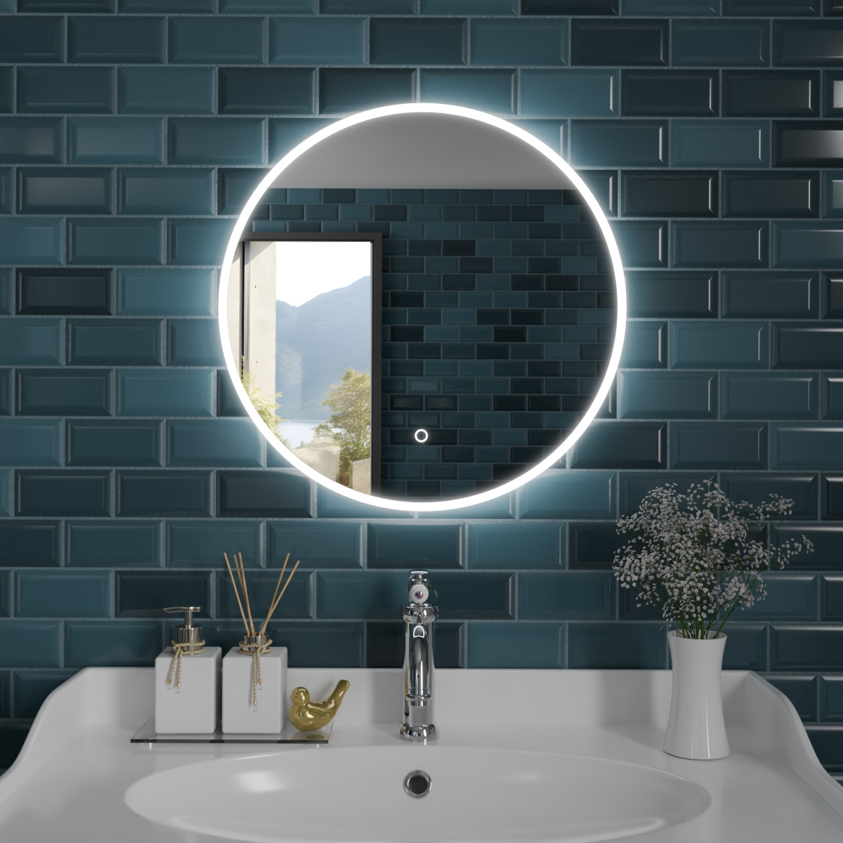
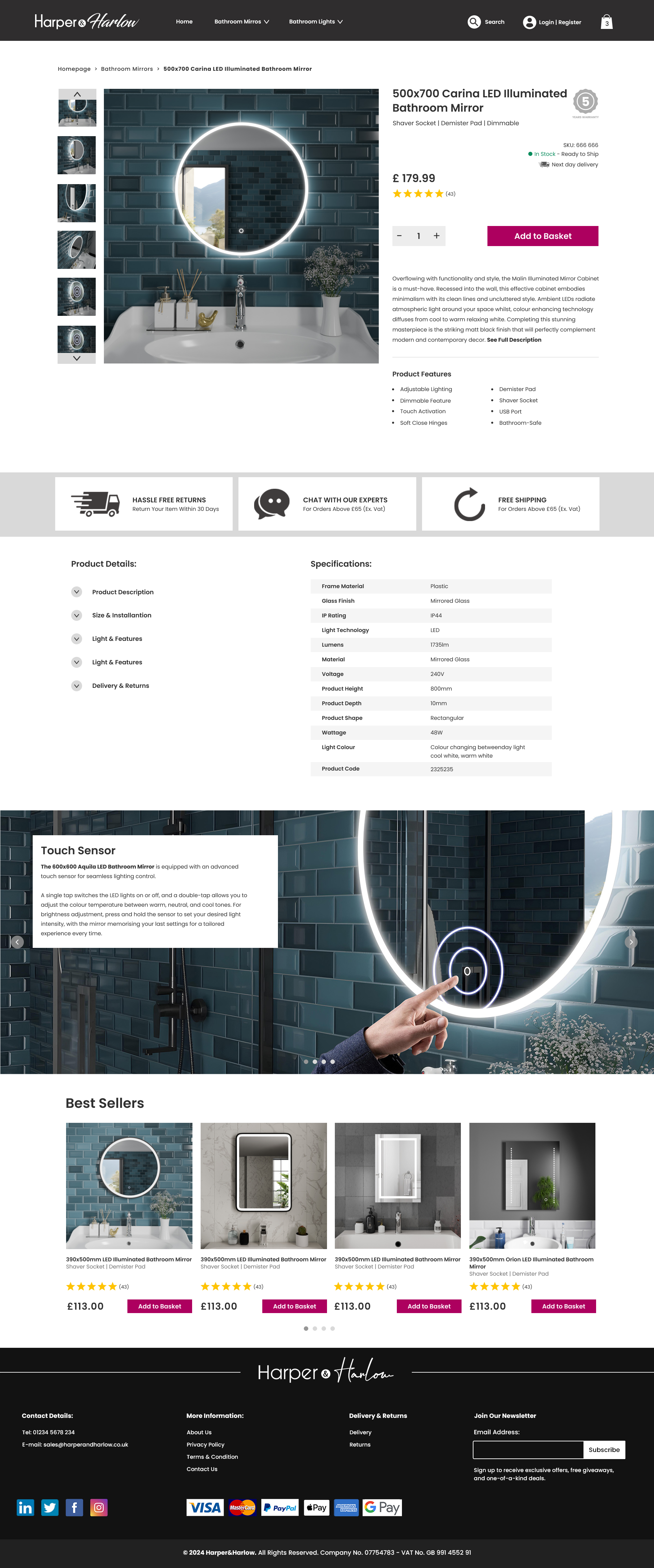
- Represent products better by using 3D Renders
- Create a more professional Branding
- Create a cleaner navigation and website structure
Who We Designed For
Before starting the design, I was provided with target audience insights from the marketing team, which helped my design decisions.
They identified two main customer groups:

Homeowners & Renters on a Budget
People looking for affordable yet stylish mirrors to upgrade their space without spending too much.
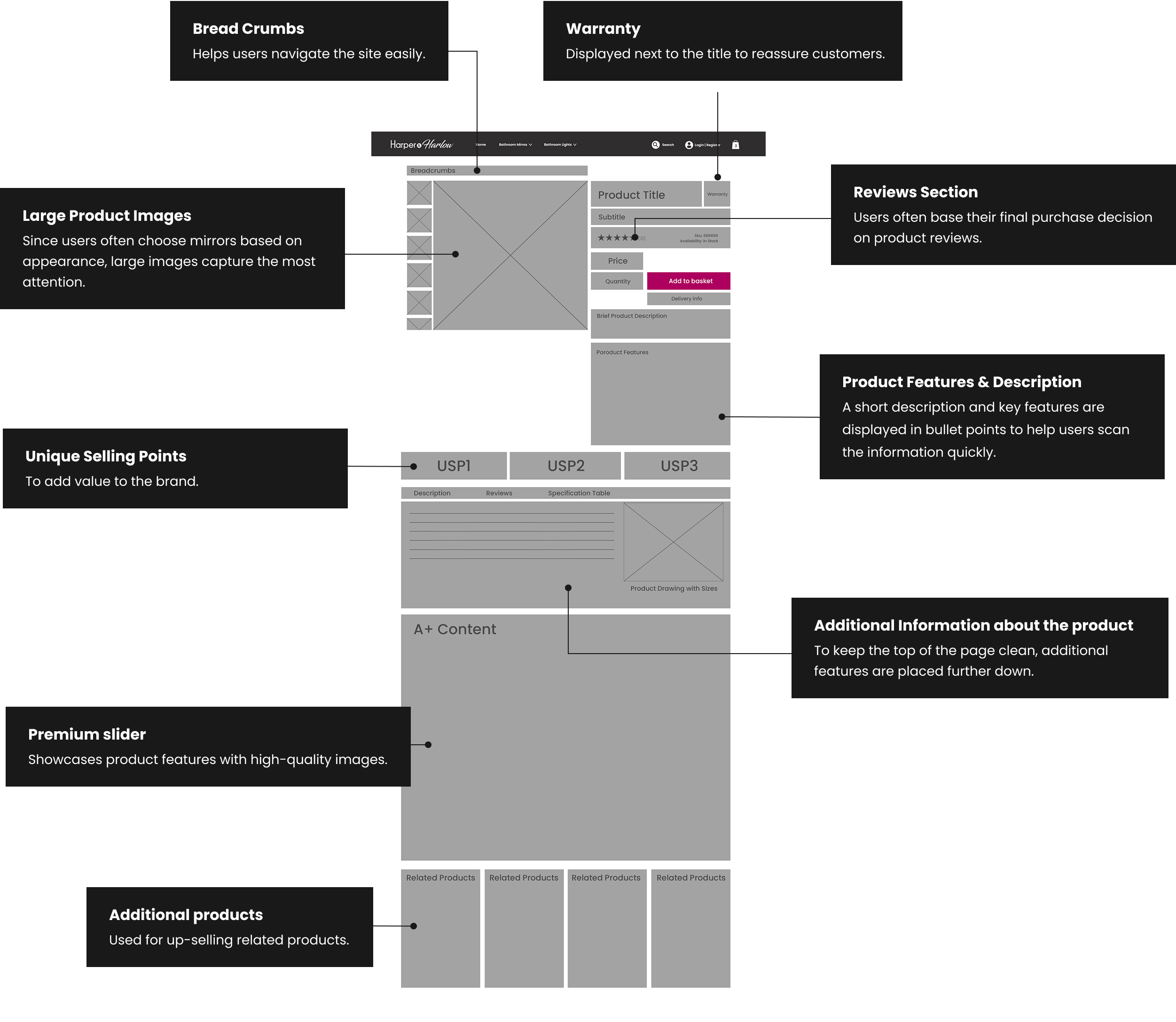
Design Strategy
We focused on showcasing value through clear pricing, clean layouts, and lifestyle images to show quality without overwhelming.

Online Shoppers Who Compare Prices
Customers who browse multiple websites, looking for good deals and value for money.
Design Strategy
We simplified the user flow, highlight discounts, trust signals (reviews, delivery info), and made product comparison intuitive.
Brand Positioning
Based on this research, we defined Harper & Harlow’s brand personality as:

Stylish & Affordable
Affordable products that feel premium thanks to polished visuals.

Trustworthy
Visible reviews, clear delivery info, and a smooth, consistent UX.

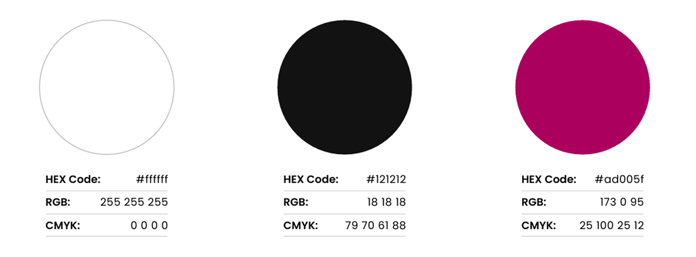
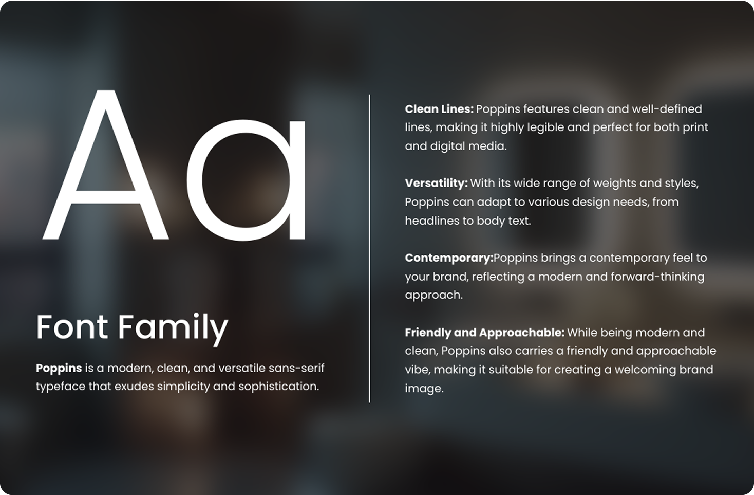
Modern
Minimalist design, neutral tones, and clean typography.
This helped shape the visual identity and website experience, ensuring it aligned with customer expectations.
Before moving on to design, I strongly recommended conducting usability testing on competitor websites to better identify pain points and understand what works. However, due to limited time and resources, we relied on competitor research and internal feedback instead.
During implementation, we ran into some styling issues that are currently being addressed with the developers. While the website is consistently generating sales, I believe there’s still room for improvement, as design is a continuous process.
Results:
The website started generating sales from day one, with dozens of mirrors sold in the first week alone.
In the first 5 months, we sold over 1,000 mirrors, exceeding the initial target.
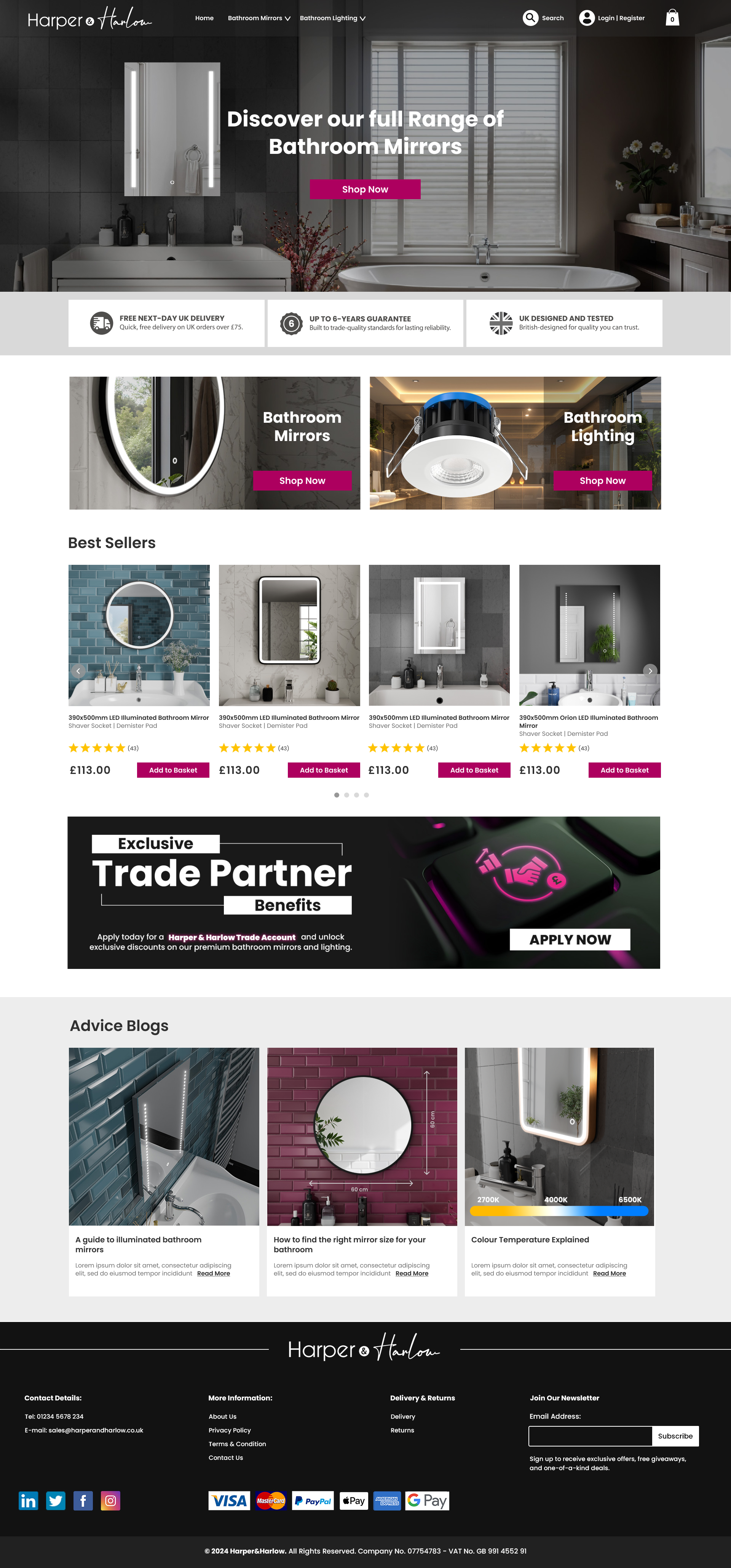
Final Thoughts:
This project allowed me to bring together my skills across different disciplines—branding, UX/UI design, 3D, and
e-commerce—to create a compelling shopping experience. Despite facing time constraints, I’m proud of what I accomplished and how the brand came to life.
What I Would Do Differently:
More Research:
I enjoy conducting usability testing, and in hindsight, I would have liked to observe users interacting with competitor websites during the early stages of the design. I also believe it would have been valuable to carry out usability testing later in the process to refine the experience further.
Polishing Post-Launch:
As soon as the website went live, the company shifted focus to other projects, leaving some styling issues unresolved. These visual inconsistencies, while minor, were important to me because I believe it's the details that elevate a design from good to great.
Continuous Improvement:
I see design as an ongoing process, there are still areas that would benefit from refinement and further testing.
Whats Next?
Fixing Styling Issues:
I would like to ensure that the remaining styling inconsistencies are resolved, so the site fully reflects the polished and premium aesthetic it was designed for.
Launching Marketing Strategies
I’d like to explore different marketing strategies to help increase traffic, drive conversions, and strengthen the brand’s online presence.
Leveraging Customer Content
I’d love to integrate customer reviews and real-life photos of their bathrooms featuring our mirrors to build social proof and trust.
Data-Driven Improvements
I would like to implement tools such as heatmaps and session recordings to gather data and better understand how users interact with the site—allowing for improvements based on real behavior rather than assumptions.
A/B Testing
I’m also interested in setting up A/B tests to evaluate different layouts, CTA styles, or messaging to continuously improve the user experience.

.png)