MARKETING CAMPAINS
MARKETING CAMPAINS
MARKETING CAMPAINS
MARKETING CAMPAINS
LampShopOnline is a leading online retailer specializing in lighting solutions for both domestic and commercial use. Throughout the year, we run promotional campaigns to launch new products, offer discounts, and drive sales through targeted marketing strategies.
As the core designer at LampShopOnline, I worked with the marketing team to create sales-driven campaigns while ensuring brand consistency. I designed marketing visuals, web and email banners, and captured high-quality product photography.
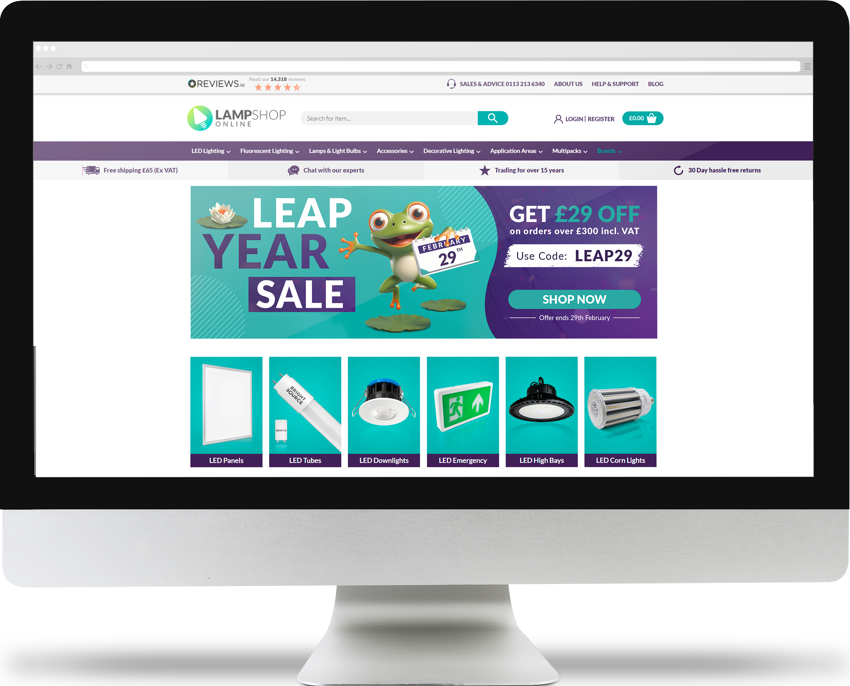
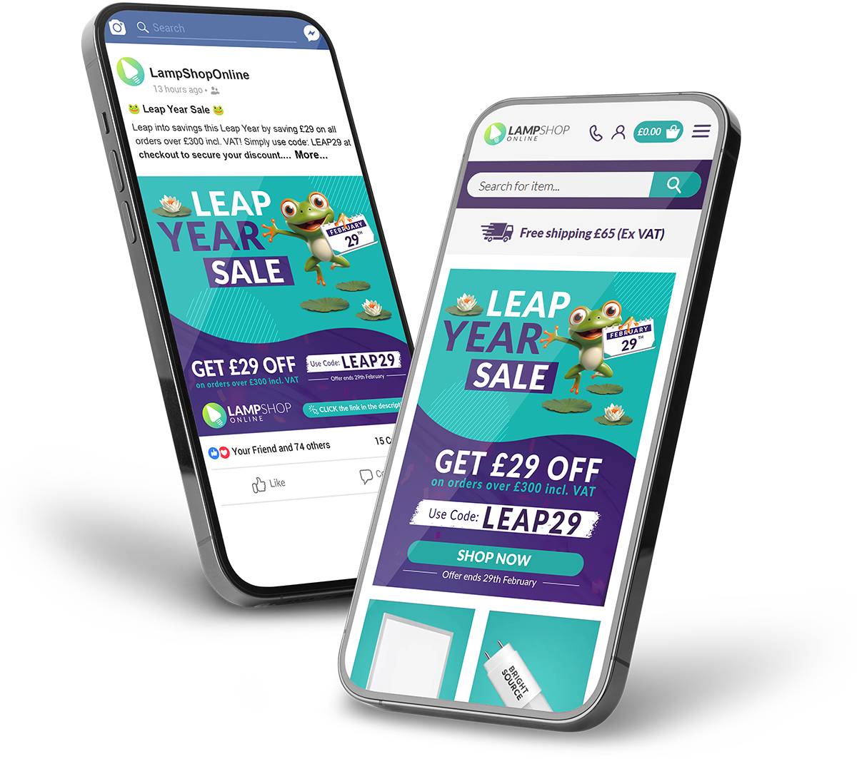
Increaseing engagement and boost order values by offering a limited-time discount on orders over £300.

The Leap Year Sale was a short-term promotion was aimed at both B2B and B2C customers.
I designed banners for various media platforms to expand the campaign’s reach while maintaining a strong brand identity. My goal was to create clear, visually engaging designs that not only captured attention but also encouraged conversions.
Visual theme:
I came up with a playful concept featuring a mid-jump frog to symbolize the ‘leap’ in Leap Year.
Considering our attention is first grabbed by the image I placed the frog in a dynamic jumping pose with its hand pointing toward the title, creating a strong focal point that naturally guides the viewer’s eye to the key message.
Once attention was captured, my goal was to lead users to read the rest of the text and click on the CTA that redirect them to the best selling product page.
Highlighting the Offer:
To emphasize the offer, I made the £29 discount larger than the surrounding text, ensuring it stands out.
Sense of Urgency:
To reinforce the limited-time offer, I displayed the expiration date on the top of the website and below the CTA on the banners.
- Encourage bulk purchasing by emphasizing value and savings.
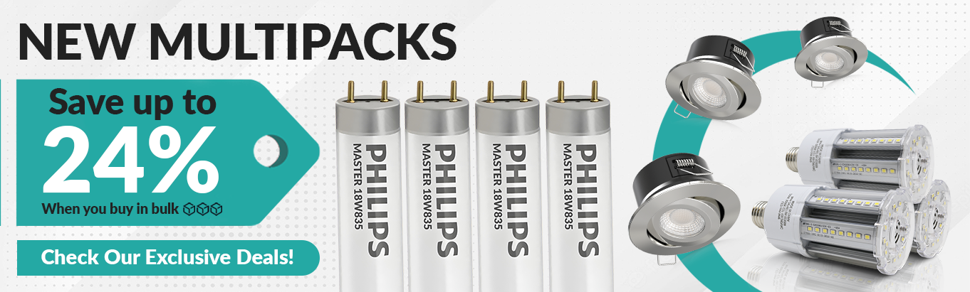
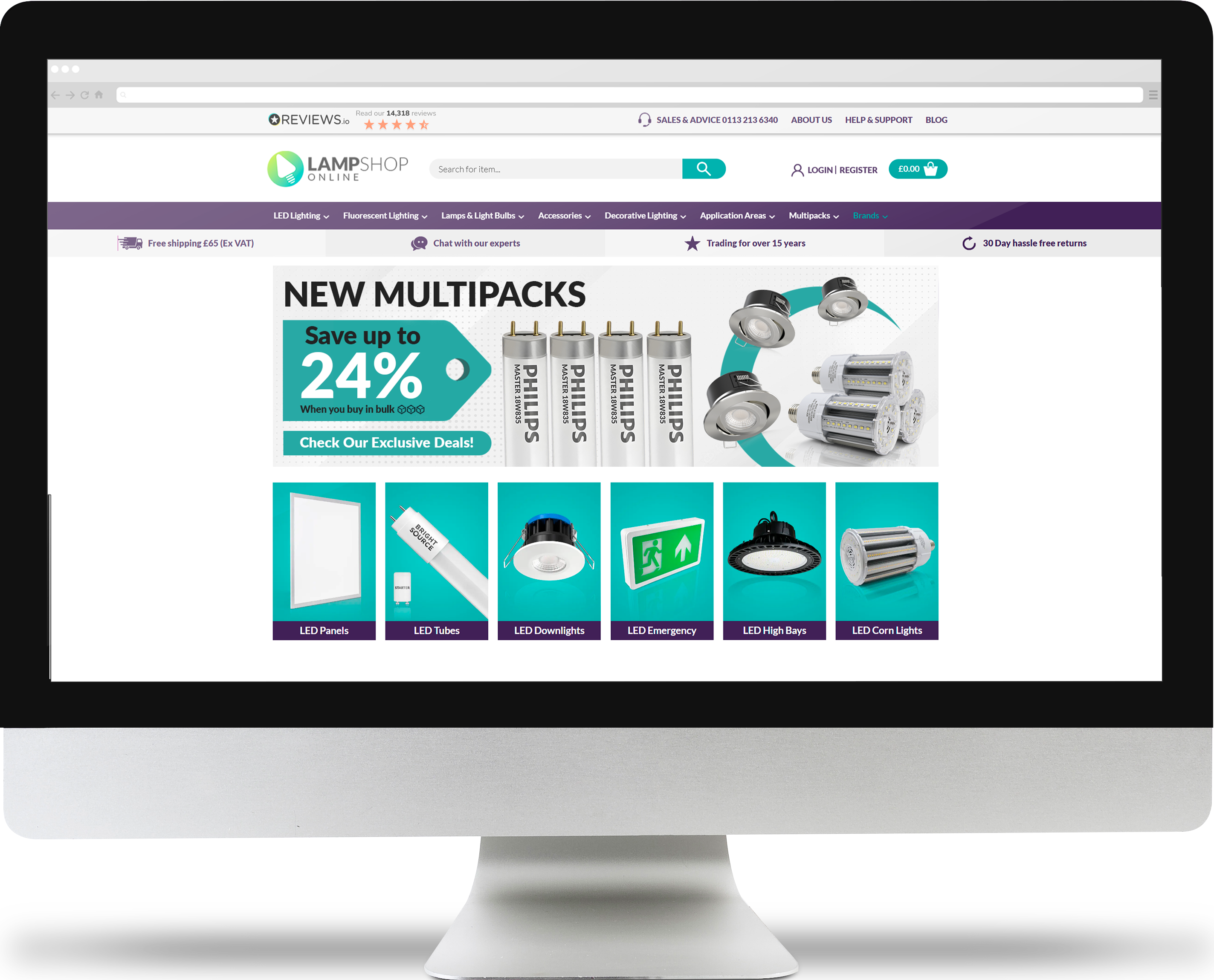
Considering that most of our customers are B2B, we launched the Multipack Campaign to encourage bulk purchases by featuring best-selling products and clear multipack options.
My role involved designing website banners, social media assets, while also improving website functionality to ensure multipack options were clearly displayed on product thumbnails.
I also handled product photography, making sure visuals were high quality and effectively highlighted the value of buying in bulk

Simplifying the Message:
Originally, I was provided by the marketing team with a long description for the homepage banner. However, I advised simplifying it and we reduced the text to focus on just three key elements:
The Offer Name:
To immediately communicate what the campaign was about.
The Discount Percentage (24%):
Displayed in bold, large typography so users could instantly see the savings.
A Call-to-Action:
Instead of a generic “Shop Now”, I suggested making it more engaging with “Check Our Exclusive Deals!” to feel more personal and inviting.
Composition:To make the multipack offer clear at first glance, I showcased our best-selling products in multiples. I kept the design simple and easy to scan, avoiding unnecessary distractions.
Used a price tag design in the shape of an arrow pointing towards the products, subtly directing attention to the savings.
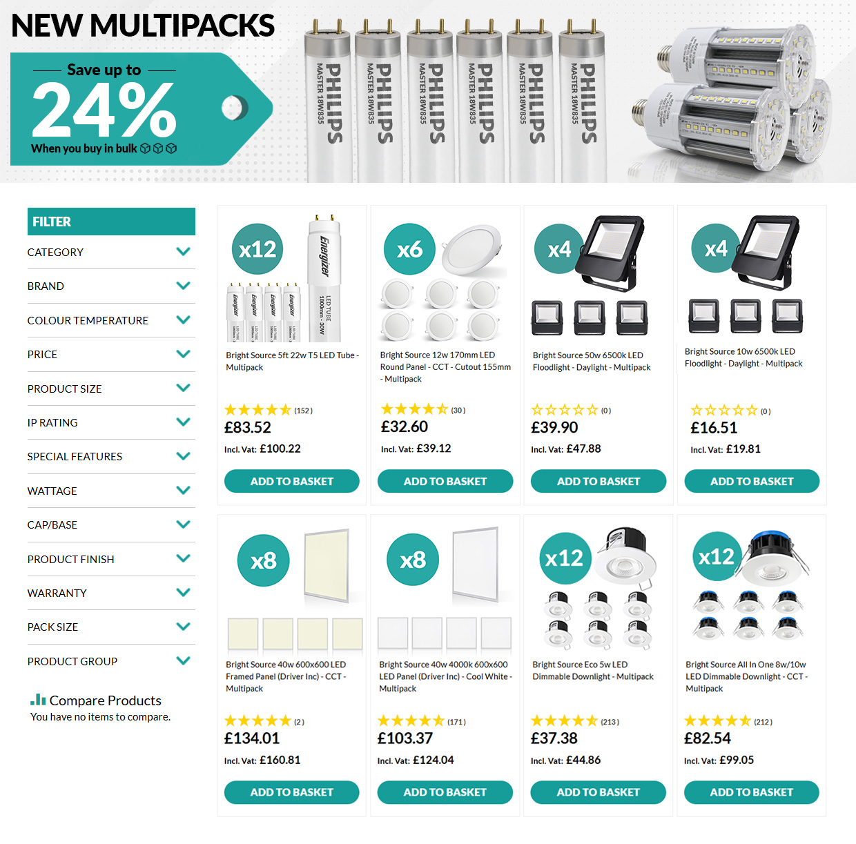

When the promotion started, our multipacks were listed separately but while the quantities have changed we need to find a better way to display them.
So we decided to add selection options on the product page to allow the user to select between the products easily without having to look for them on the product page.
We are also about to implement an extra feature on the category page allowing the user to select the quantity straight away from the category page without the need to product page