

Over the last several years, I have worked across commercial design projects, including digital marketing campaigns, branding, and print materials.
Working closely with marketing teams and stakeholders, I created visual assets that supported commercial objectives while maintaining consistency across multiple channels.
The projects below showcase my experience across branding, marketing and digital communications.

Harper & Harlow - Campaign Overview
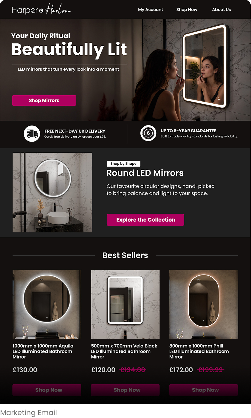
Harper & Harlow is an e-commerce brand specialising in illuminated and non-illuminated mirrors. It sits at the premium end of the group and sells direct to customers rather than trade. This campaign was about showing what makes the brand worth choosing, rather than pushing a short-term offer. No price, no discount, no end date.
What I designed
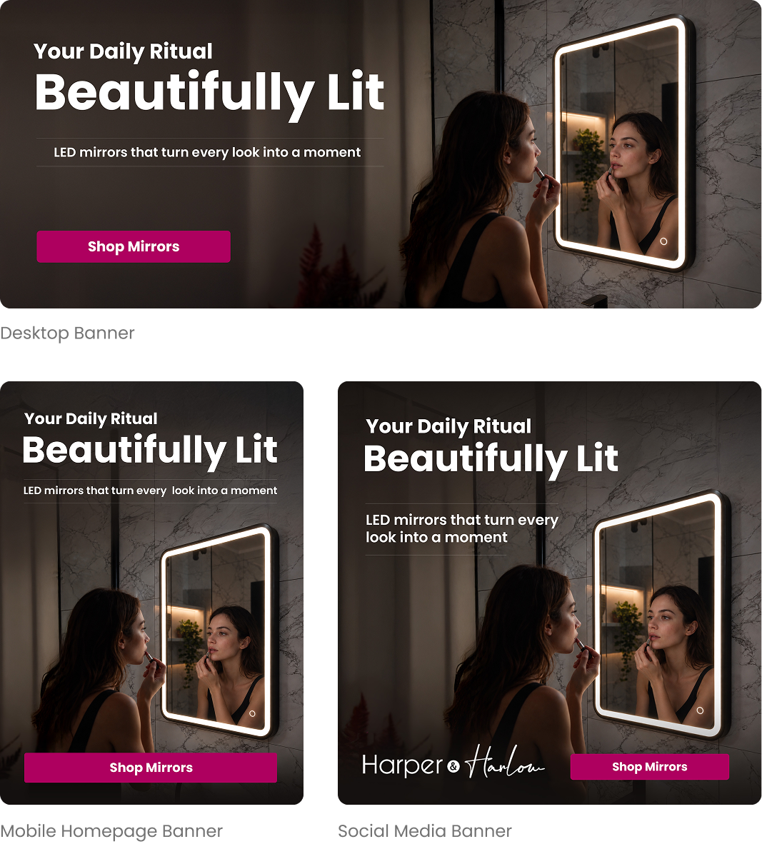
A homepage banner for desktop and mobile, the full campaign email, and a square version for Instagram and Facebook.
Design decisions
The banner is built from one of the 3D renders I'd already created for the product listings, with a woman added afterwards using AI.
The woman looks at her reflection rather than the camera, making the scene feel like a quiet moment in someone's morning and drawing the eye to the mirror.
I kept the room's colours muted so the magenta button - the brand's colour, reads as the brightest accent on the page. The copy focuses on how the mirror fits into a morning routine instead of listing technical specs.
.png)
Spring Savings - Campaign Overview
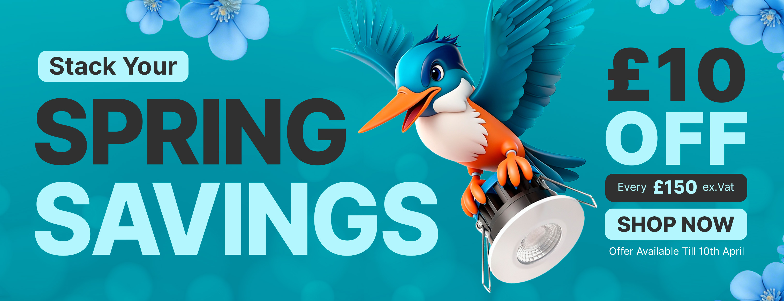
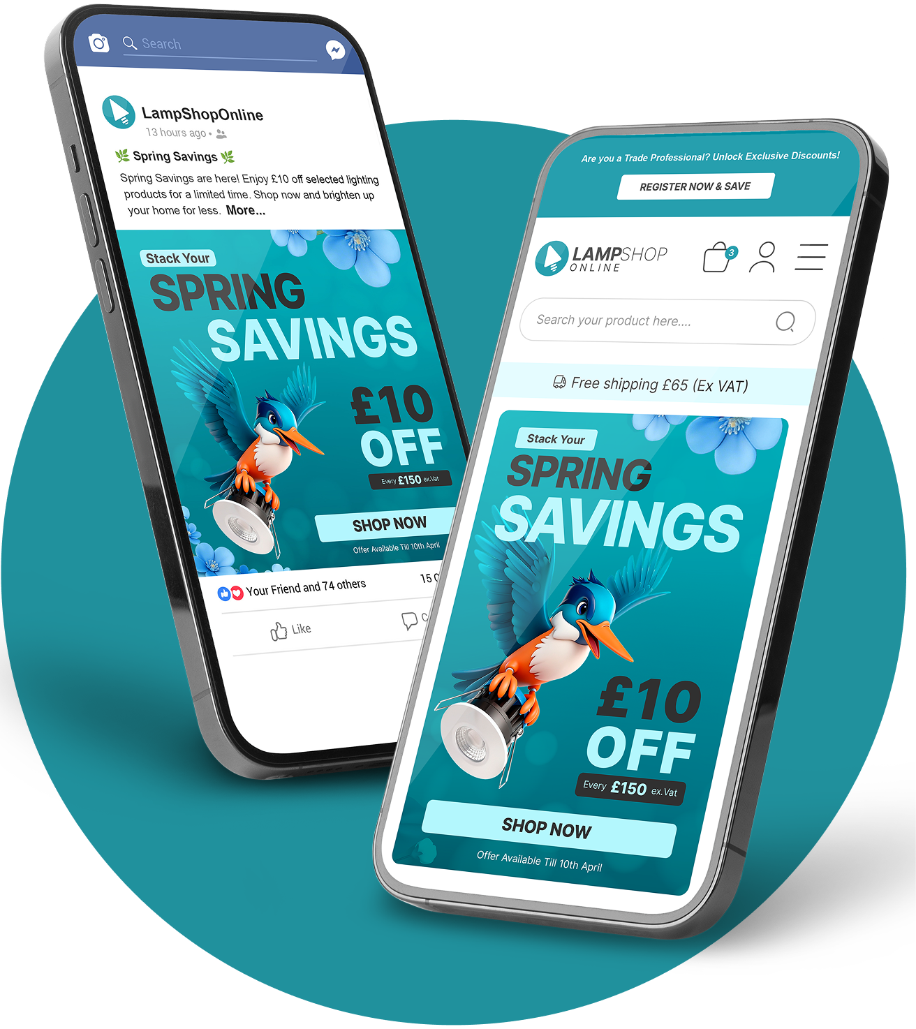
LampShopOnline mainly serves trade customers, so the spring offer encouraged larger orders: customers got £10 off for every £150 they spent. The banner needed to make the offer, end date and next step easy to spot, even at a small size.
What I designed
Responsive banners for desktop, mobile and app, plus a square version for Facebook and Instagram.
Design decisions
Spring needed a seasonal look that wasn't all flowers. I combined a product photo I'd taken previously with an AI-generated kingfisher, and built the composition and background around them.
The bird's colours fit the brand's turquoise, and it holds the light in its claws as if bringing it forward, which keeps the offer feeling like part of the range and gives the composition a sense of movement.
The offer has one condition, so I kept the message simple. "Stack Your" introduces the deal, £10 gets the most attention, and the £150 spend requirement sits just below it. The expiry date is tucked under the CTA to add a little urgency without distracting from the offer.


MARKETING VIDEOS
As part of my role, I produced a range of promotional videos to support digital marketing activities. This involved directing green screen productions, setting up lighting and camera equipment and editing content using 3D renders and photography I had previously created to ensure a consistent visual identity across all channels.
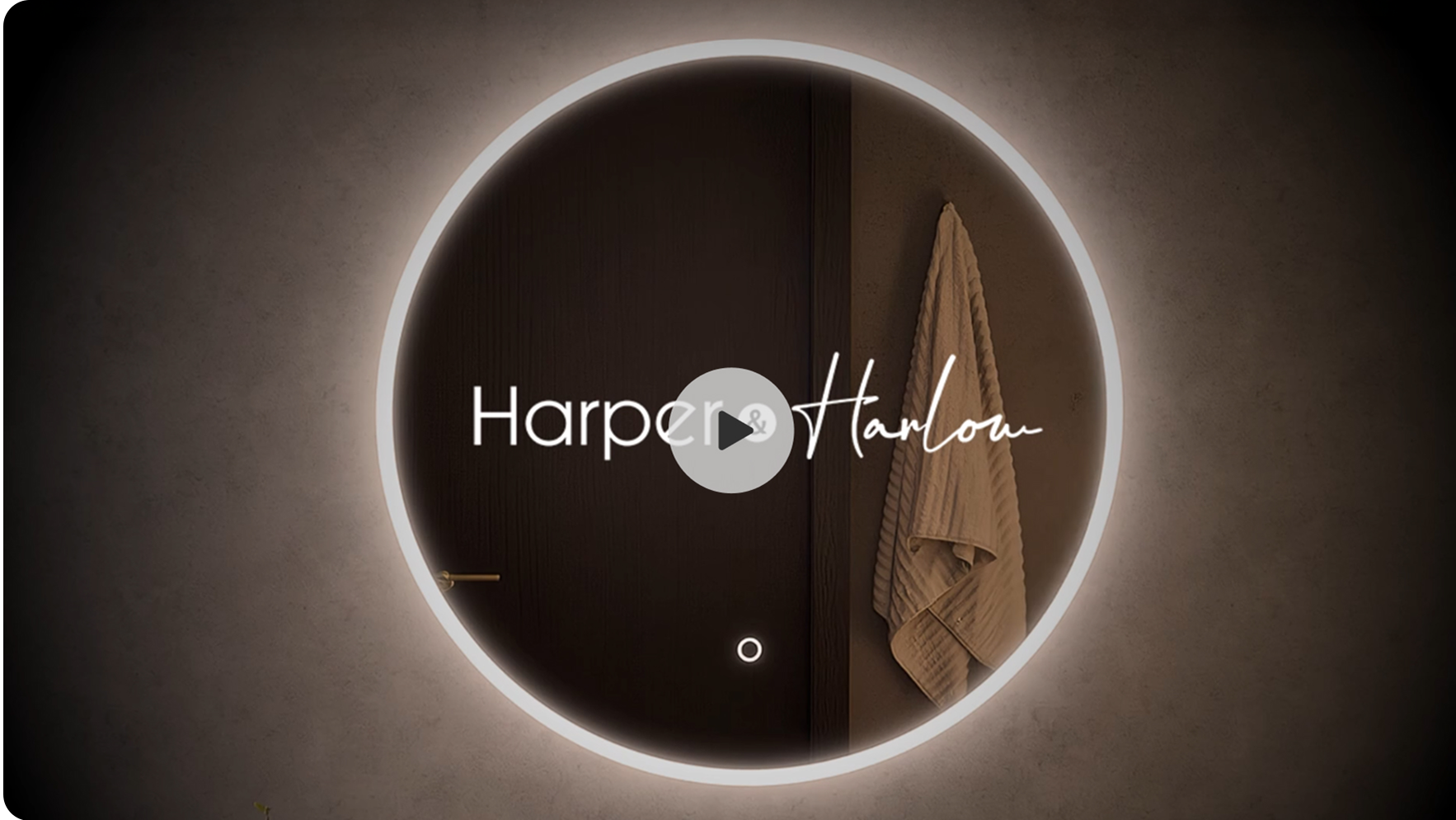
Harper & Harlow
From concept to final delivery, I was responsible for the creative direction of this promotional video.
I developed the script and voiceover content, and combined 3D renders I had previously created to produce a premium campaign asset for desktop, mobile and social media platforms while maintaining the Harper & Harlow brand identity.
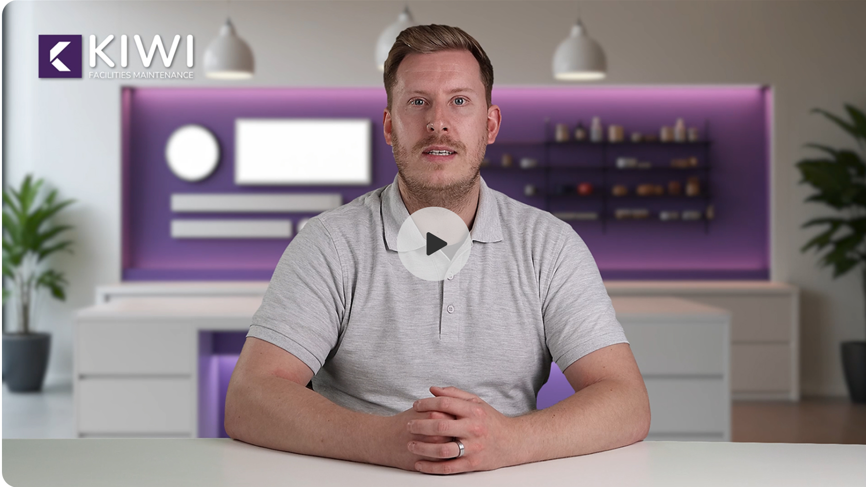
Kiwi Facility Videos
I planned and directed this green screen production from setup to final edit.
This included preparing the studio, setting up lighting and camera equipment, directing the shoot, and editing the final video to create clear, engaging content for the Kiwi Facilities website and marketing channels.
3D RENDERS & PHOTOGRAPHY
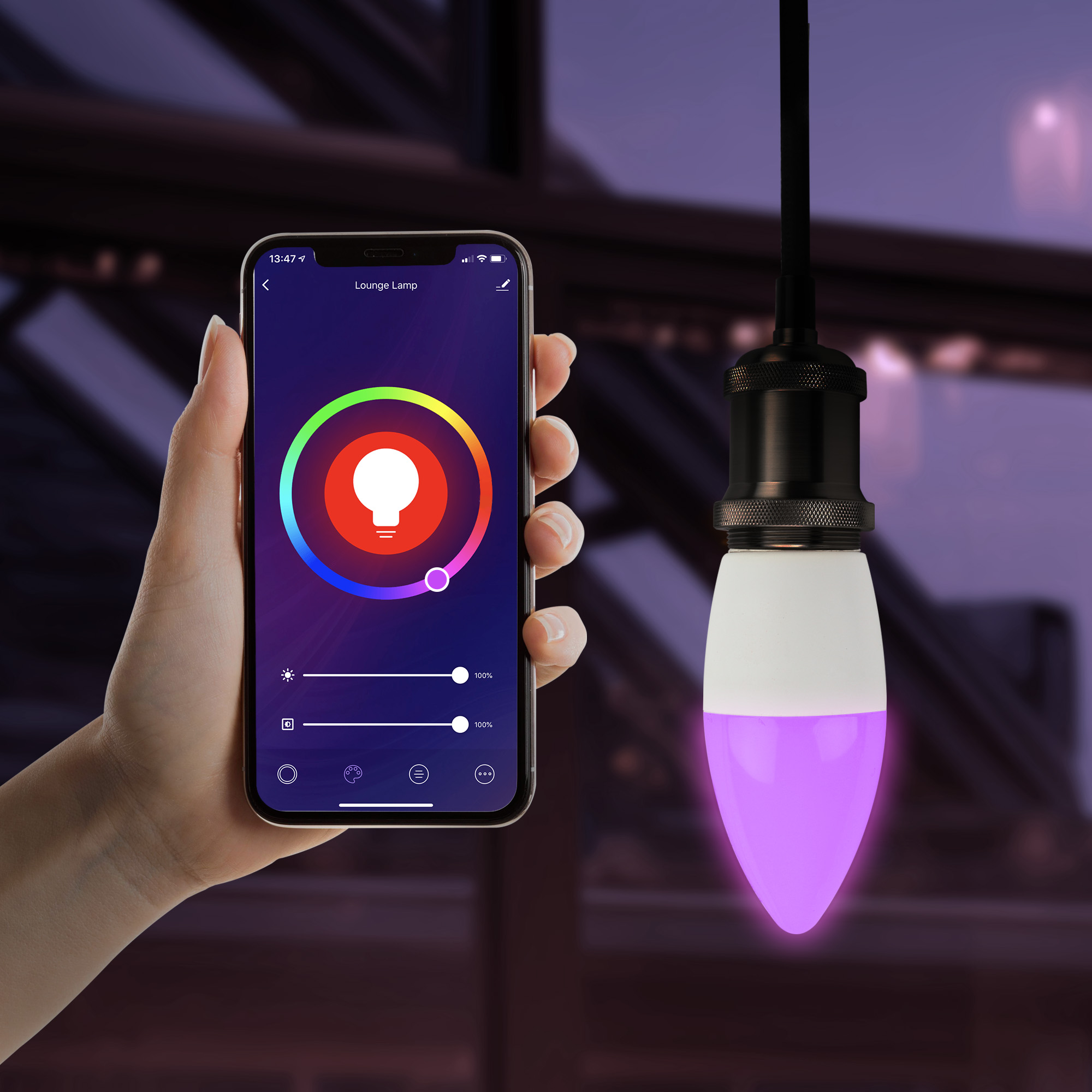
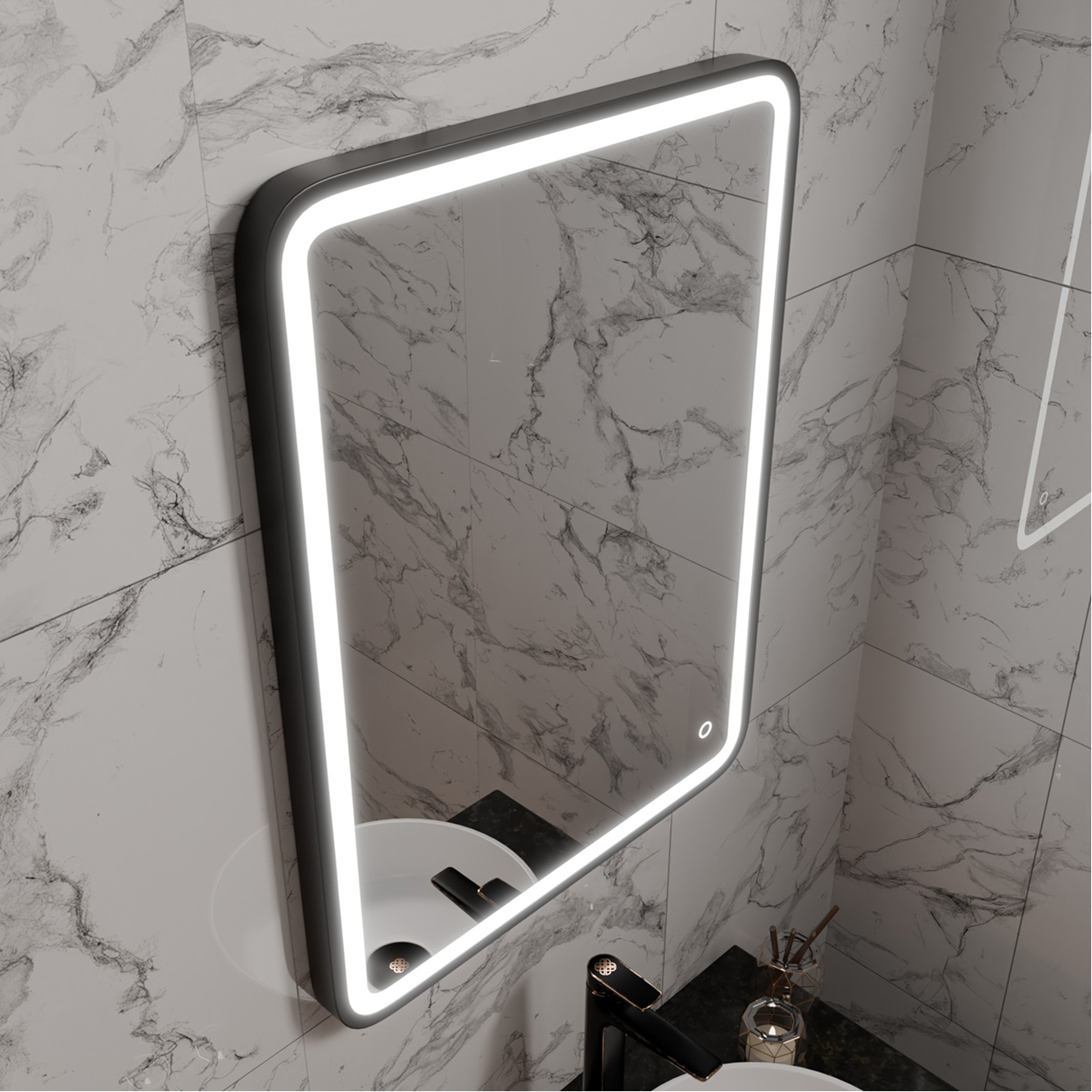
To support marketing campaigns and product launches, I created original photography and 3D visualisations used across websites, social media, promotional materials and videos. Producing assets in-house allowed for greater creative control and helped maintain a consistent visual identity across multiple channels.
PRODUCT PHOTOGRAPHY
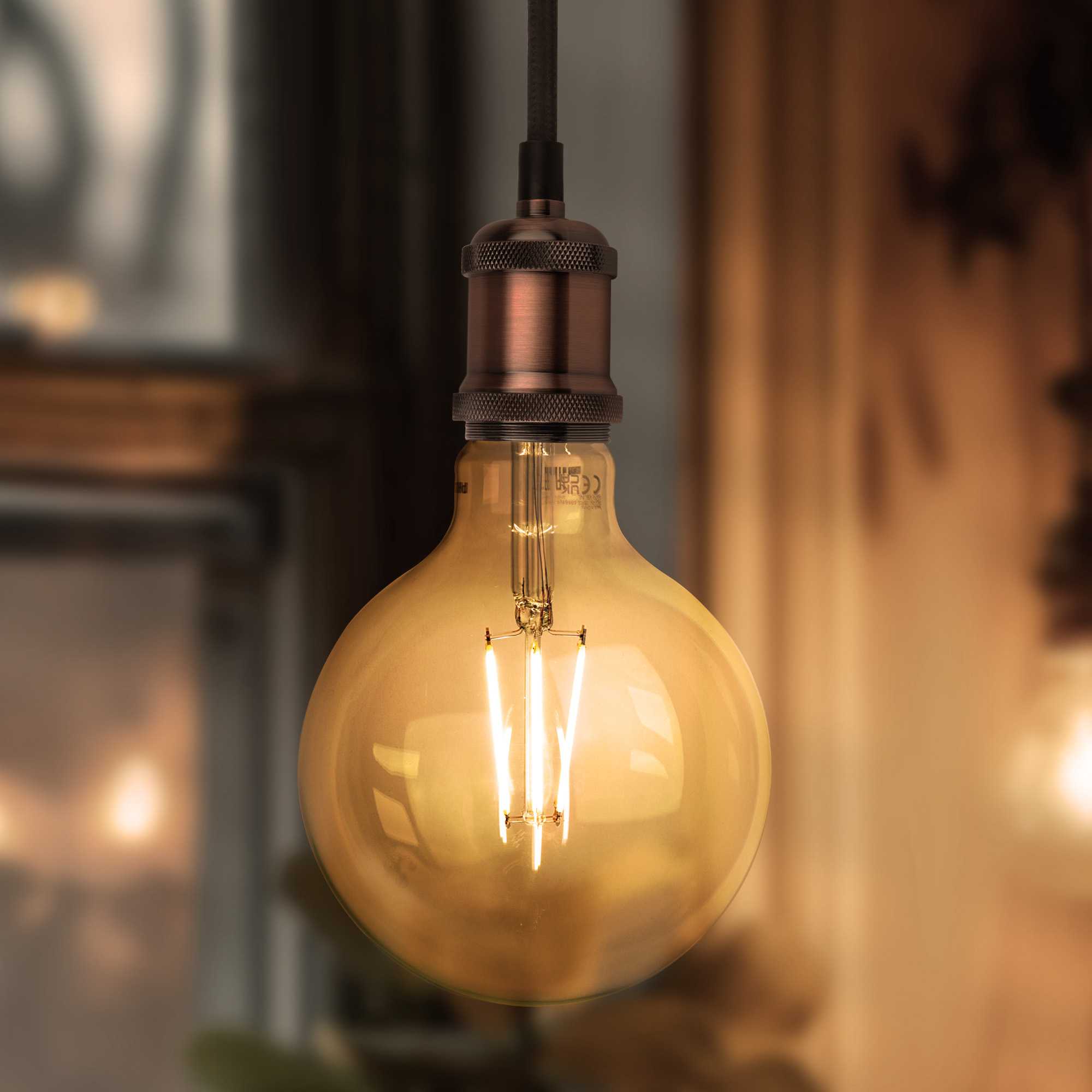
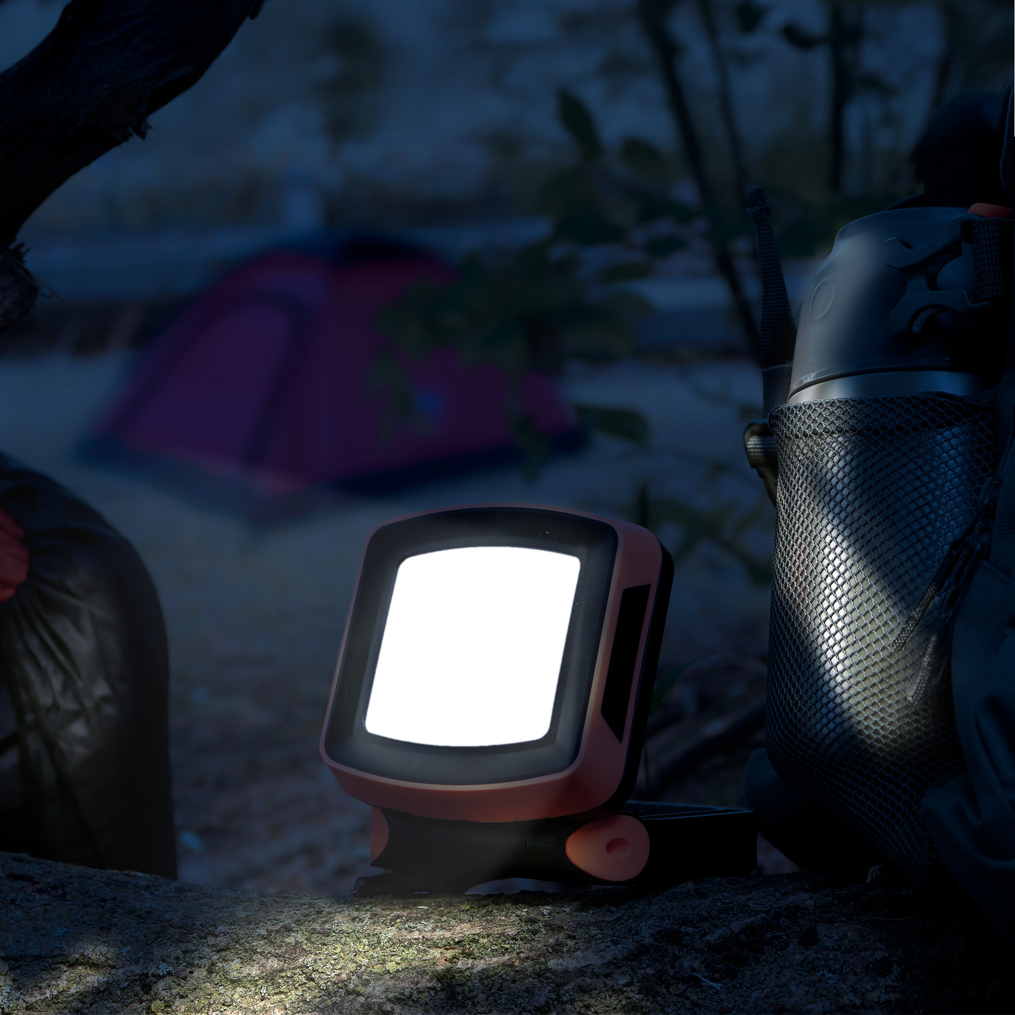
3D PRODUCT RENDERS
.jpg)
%201.jpg)


COMMERCIAL APPLICATIONS
The assets created through photography and 3D visualisation were integrated into product pages, homepage banners, videos and promotional campaigns to deliver a consistent premium experience.

Harper & Harlow Homepage

LampShopOnline Product Page
BRANDING
Selected identity projects created for businesses across media, fashion and professional services. From logo development to complete visual systems, each project was designed to create a distinctive and memorable brand presence.
THE ONE FAMILY
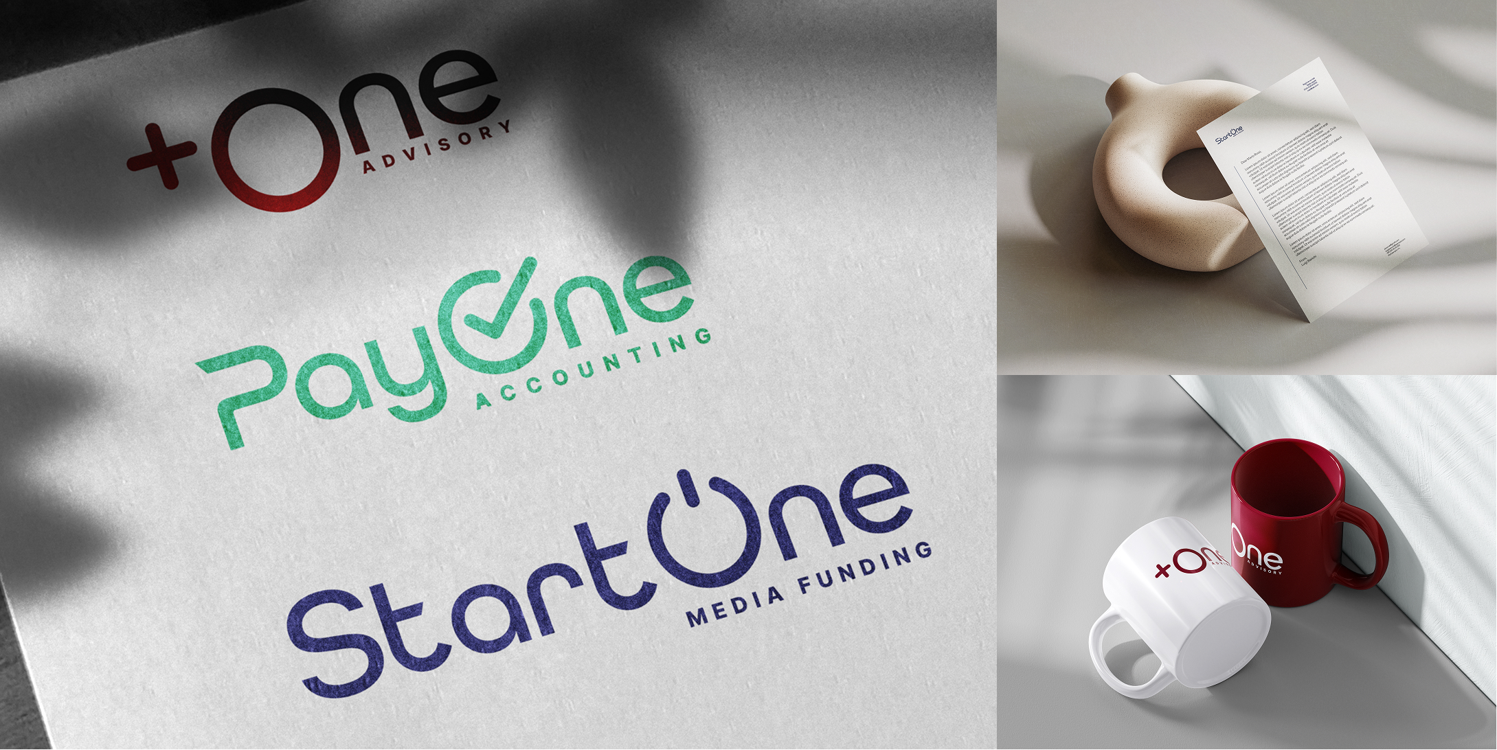
A connected ecosystem of brands operating within the audiovisual industry. Three distinct companies. One cohesive identity system.
OBJECTIVE
Design a scalable identity system that could unify three specialist businesses under one visual language while giving each company its own positioning, personality and colour palette. The system needed to remain flexible across digital, print and corporate applications while supporting future growth.
OVERVIEW
The One Family is a unified identity ecosystem developed for three companies operating within the audiovisual industry. While each business serves a different stage of the production process, they share a consistent visual language that strengthens recognition while allowing each brand to communicate its own distinct personality.
MY ROLE
- Brand Strategy
- Logo Design
- Art Direction
- Website Design
- Brand Guidelines
- Visual Identity
- Brand Strategy
- Logo Design
- Art Direction
- Website Design
- Brand Guidelines
- Visual Identity
IDENTITY SYSTEM
Designed as a unified brand ecosystem, the identity system balances consistency with individuality across three distinct companies.
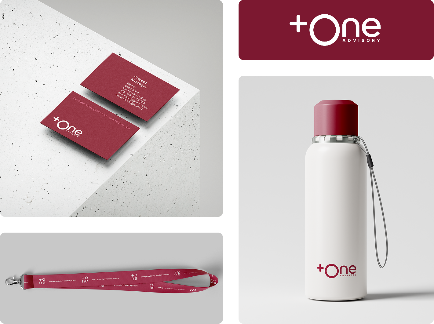
+One established the original visual language, which later informed the development of StartOne and PayOne.
Shared typography, logo construction and a common neutral palette create recognition across the group, while distinctive accent colours and messaging communicate each brand's unique role.

SHARED TYPOGRAPHY
Both typefaces were selected to create a consistent visual language across the entire ecosystem. Funnel Display adds distinctive personality to headlines, while Poppins provides excellent readability across digital, print and corporate communications.

SHARED COLOUR SYSTEM
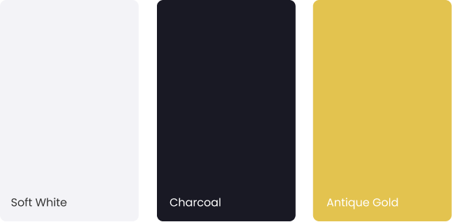
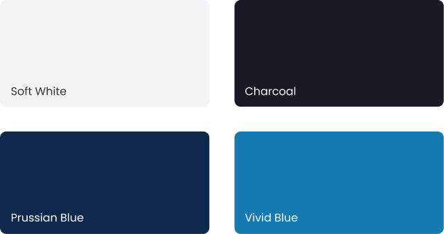
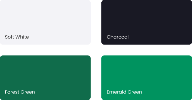
Every identity shares the same neutral foundation of Soft White and Charcoal, creating consistency throughout the ecosystem.
Each brand is then distinguished by its own accent colour, reinforcing its individual personality while maintaining immediate recognition as part of the same family.
+One Advisory
Developed as the first identity within the ecosystem, +One Advisory established the visual foundation for the two brands that followed.
The identity was designed for a strategic consultancy serving film producers and audiovisual businesses, balancing professionalism with a more personal and approachable character.
Rounded geometry, restrained typography and a refined colour palette create a contemporary identity that communicates trust while remaining accessible.
The identity was designed as a flexible system capable of scaling consistently across print, promotional merchandise and everyday brand touchpoints.
Primary Colour Palette

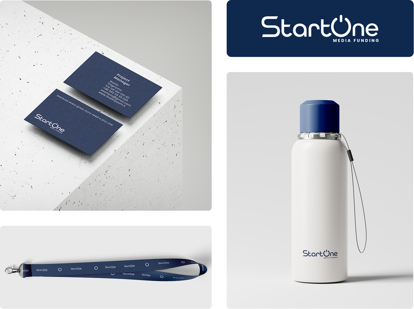
StartOne Media Funding
Developed as the financial pillar of the ecosystem, StartOne provides strategic funding consultancy for film and audiovisual productions. Unlike +One's advisory role, StartOne represents the corporate side of the group, communicating expertise, precision and institutional trust.
Rounded geometry, structured typography and a refined blue colour palette create a contemporary identity that reflects confidence, stability and innovation.
Primary Colour Palette

PayOne Accounting
Developed as the operational arm of the ecosystem, PayOne delivers the financial and administrative support that keeps productions running smoothly.
Unlike +One's advisory role and StartOne's funding expertise, PayOne focuses on execution, managing accounting, payroll and production operations with accuracy and efficiency.
The identity combines rounded forms, clean typography and a vibrant green palette to communicate reliability, clarity and operational precision.
Primary Colour Palette
PRINTING & PROMOTIONAL MATERIALS
I have designed a wide range of printed and promotional materials for businesses across retail, hospitality, construction, renewable energy and entertainment industries. From catalogues and brochures to flyers, menus and campaign assets, my work focuses on creating visually engaging materials that communicate clearly and strengthen brand identity.
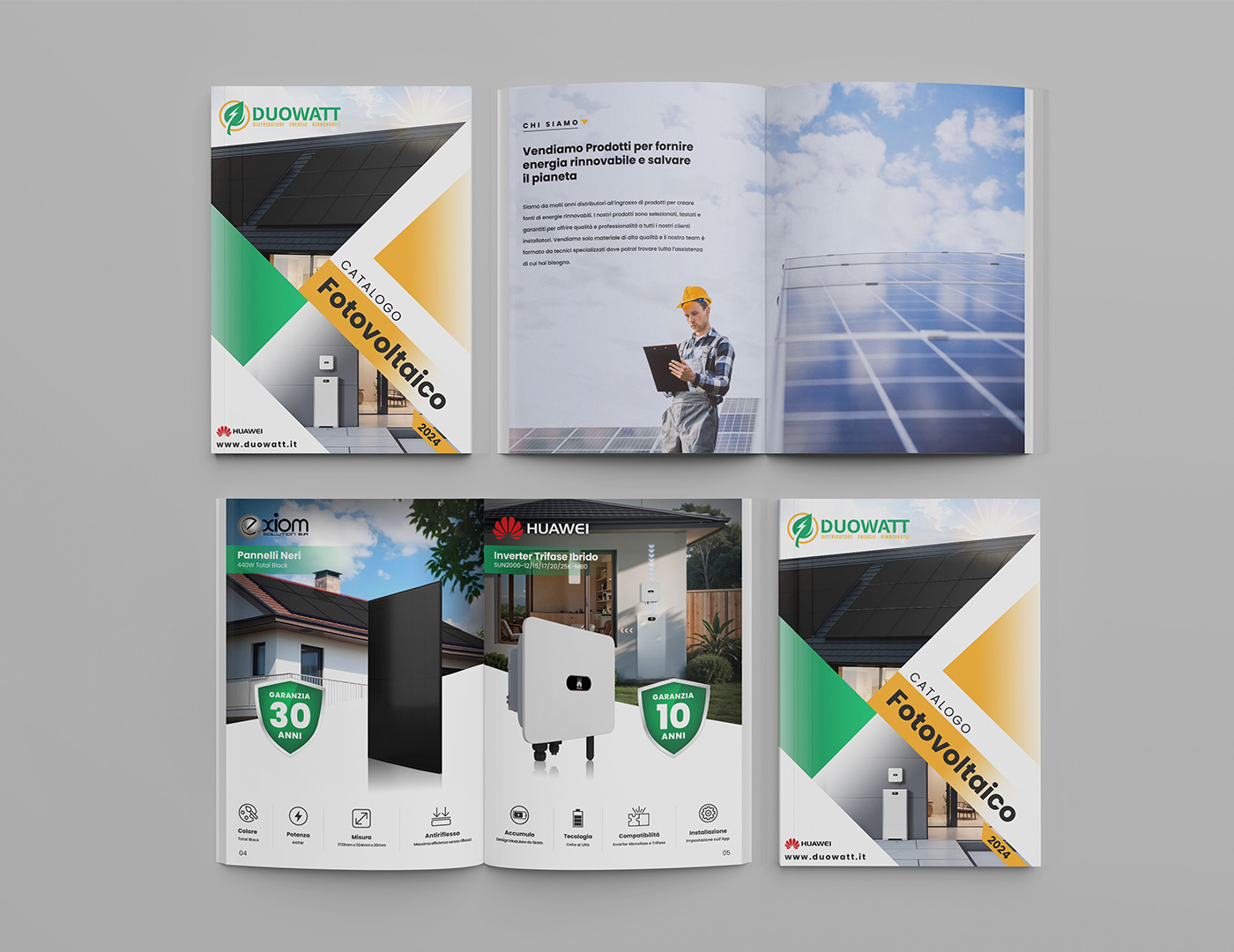
Duowatt Catalogue
40+ page catalogue designed for a renewable energy distributor in Italy, combining editorial layouts, product information and brand consistency across print materials.

Macleod Organics Flyer
Double-sided flyer for an organic farm delivery service in Scotland. The front sells the service, the back makes the case for organic farming and asks the reader to be part of it.

NeoVR Campaign
Promotional materials created for the biggest VR Studio in Warsaw, including price lists, invitations and gift cards to support marketing campaigns and customer engagement.